Skip to main content

hey… welcome! Can you share the data model - possibly some sample documents? We might be better able to assist if we understand the structure of the documents.
Ok… so I put this together in response… hope you find it helpful.
https://github.com/mrlynn/mongodb-community-forums-316436
1. Seed Sample Data (Python Script)
Make sure you’ve got a MongoDB Atlas cluster and pymongo + python-dotenv installed.
requirements.txt
pymongo
python-dotenv
.env
MONGODB_URI=mongodb+srv://<username>:<password>@<cluster-url>/test?retryWrites=true&w=majority
seed_data.py
import os
from pymongo import MongoClient
from datetime import datetime
from dotenv import load_dotenv
# Load credentials
load_dotenv()
mongo_uri = os.getenv("MONGODB_URI")
client = MongoClient(mongo_uri)
# Set database and collection
db = client["charts_demo"]
collection = db["status_log"]
collection.delete_many({}) # Clear collection for repeatability
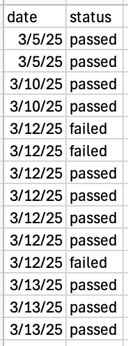
# Sample data (with gaps in dates)
raw_data = [
{"date": "3/5/25", "status": "passed"},
{"date": "3/5/25", "status": "passed"},
{"date": "3/10/25", "status": "passed"},
{"date": "3/10/25", "status": "passed"},
{"date": "3/12/25", "status": "failed"},
{"date": "3/12/25", "status": "failed"},
{"date": "3/12/25", "status": "passed"},
{"date": "3/12/25", "status": "passed"},
{"date": "3/12/25", "status": "passed"},
{"date": "3/12/25", "status": "passed"},
{"date": "3/12/25", "status": "failed"},
{"date": "3/13/25", "status": "passed"},
{"date": "3/13/25", "status": "passed"},
{"date": "3/13/25", "status": "passed"},
]
# Format and insert
docs = [
{"date": datetime.strptime(entry["date"], "%m/%d/%y"), "status": entry["status"]}
for entry in raw_data
]
collection.insert_many(docs)
print("✅ Data inserted into charts_demo.status_log")
2. Create the Chart in MongoDB Charts
Step-by-Step:
- Go to MongoDB Charts and log in
- Create a new Dashboard
- Add a data source: choose the
charts_demo.status_logcollection - Click “Add Chart” → Select Line Chart or Discrete Line
- Switch to Library mode in the top bar
- Paste in the following aggregation pipeline:
[
  {
    $group: {
      _id: { date: "$date", status: "$status" },
      count: { $sum: 1 }
    }
  },
  {
    $group: {
      _id: "$_id.date",
      counts: {
        $push: {
          k: "$_id.status",
          v: "$count"
        }
      }
    }
  },
  {
    $project: {
      _id: 0,
      date: "$_id",
      counts: { $arrayToObject: "$counts" }
    }
  },
  {
    $densify: {
      field: "date",
      range: {
        step: 1,
        unit: "day",
        bounds: "full"
      }
    }
  },
  {
    $addFields: {
      "counts.passed": { $ifNull: ["$counts.passed", 0] },
      "counts.failed": { $ifNull: ["$counts.failed", 0] }
    }
  }
]
Click Apply.
3. Configure the Chart Layout
- X-Axis:
date - Y-Axis:
- Add
counts.passed(Aggregate: Sum) - Add
counts.failed(Aggregate: Sum)
- Add
- Leave Series blank
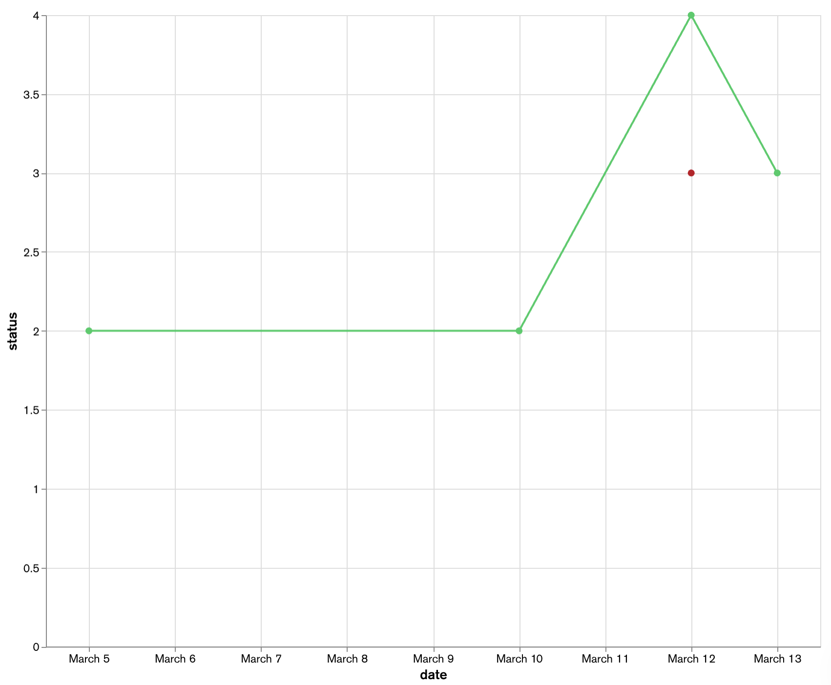
- Customize title: “Test Results per Day with Missing Dates Shown”
Final Result
You’ll see a line chart showing:
- Test result counts (passed/failed)
- All days between March 5 and 13, including zero-count days
Michael, thank you so much for this solution! It’s very detailed, easy to understand, and did exactly what I needed it to. It seems that I need to learn more about aggregation, which I’ll have to find some documentation on.
Thanks again
Brian,
So glad you found it helpful!!
Regards,
Mike
New & Unread Topics
| Topic | Replies | Views | Activity |
|---|---|---|---|
| Comparing Two Columns in Mongo Charts (Using Table) | 1 | 770 | May 2024 |
| How to pass dynamic values to aggregate query through code? | 1 | 1.2k | Jun 2024 |
| Custom data endpoint for charts | 1 | 390 | Jun 2024 |
| Chart SDK - ‘preFilter’ property is not available for createChart() method in @mongodb-js/charts-embed-dom | 3 | 295 | Jul 2024 |
| Unable to Enable Injection Function | 0 | 24 | Oct 2024 |