Interactive Filtering
On a dashboard, you can interact with a chart that has Filter or highlight enabled to filter data in other charts.
With Filter or highlight enabled, clicking a chart element with an associated dashboard filter temporarily reconfigures the scope of that dashboard filter to a single chart series, category or field value.
Interactive filtering is useful for getting quick insights into subcategories of your data on dashboards with multiple charts. Interactive filtering is temporary; you can revert to your original dashboard filter at any time.
To enable Filter or highlight:
Go to the Dashboards page.
For instructions, see Dashboards.
Select the desired dashboard.
Hover over the chart on the dashboard to reveal four buttons in the upper right corner of the chart.
Click the second button for Interactive Filters.
Select Filter or highlight from the dropdown.
Note
By default, charts set Interactive Filters to Filter or highlight.
Setting a chart's Interactive Filters to Filter reflects dashboard filters and temporary interactive filters. That chart cannot be highlighted to set interactive filters on other charts.
Setting a chart's Interactive Filters to Ignore ignores any dashboard or interactive filters.
Example
On the Atlas Charts Sample Dashboard, movie statistics are displayed across a range of chart types.
If you create a dashboard filter for rated, the content rating
of a movie (e.g. G, PG-13, R), you can click a specific movie rating
on any one of your charts to temporarily reconfigure the scope of
your dashboard filter to that specific movie rating.
If you click on the PG-13 rating section of the
Movie Ratings donut chart, the rest of the charts on
your dashboard update to display only data for PG-13 movies. When
you clear the selection of the
PG-13 rating, your dashboard reverts to displaying charts according
to the rated dashboard filter.
The chart upon which you set an interactive filter is highlighted, not filtered. It emphasizes the element for which your other charts are filtered. You can clear the selection from that highlighted chart.
A highlighted chart displays a status icon in the bottom left corner.
Filtered charts display the icon.
You can apply an interactive filter to all chart types except:
Filter a Dashboard by a Chart Element
To interactively filter a dashboard based on a chart element, you must first create a dashboard filter for the field that you want to filter by.
Example
To filter the Sample Dashboard to only
English movies, you must have a dashboard filter on the language
field.
To filter a dashboard by a chart element, you can click on:
a legend entry
a chart category, such as an X or Y series label
a chart mark, such as a bar segment or line chart node
When you hover over a chart element with an associated dashboard filter, your cursor displays the icon.
If a chart element isn't filterable, your cursor displays the icon. You might be able to add a dashboard filter for that value's field to make that element filterable.
Note
If the dashboard filter card associated with a clicked element is disabled, Charts enables it temporarily until you clear the selection of that element.
When you filter a dashboard by a chart element, Charts disables all other dashboard filters until you clear the selection.
Remove an Interactive Filter
You can remove an interactive dashboard filter by:
Clicking the whitespace on the highlighted chart upon which you set the interactive filter, or
Changing the associated dashboard filter.
Click to Emphasize Series
Chart viewers can interact with a chart to highlight one or more series in a multi-series chart. This behavior applies to any chart type that displays a discrete color legend, except for geospatial charts. The following chart types support emphasizing specific series:
Emphasize a Single Series
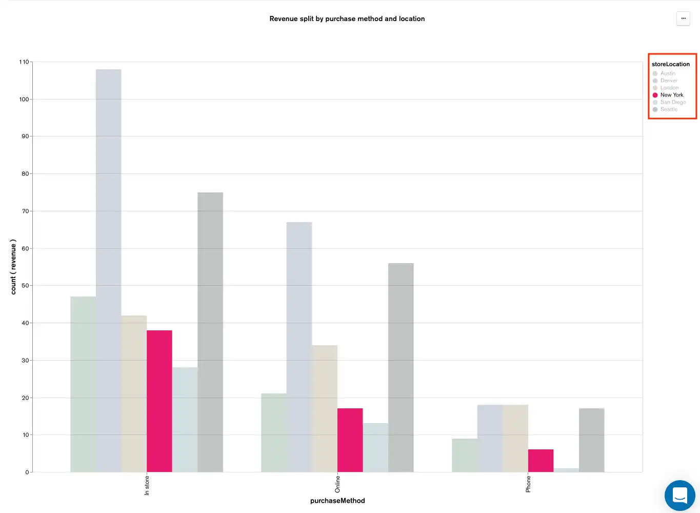
When you click a label in the chart legend at the top right, Charts emphasizes the selected data series by reducing the opacity of all the other data series.

Emphasize Multiple Data Series
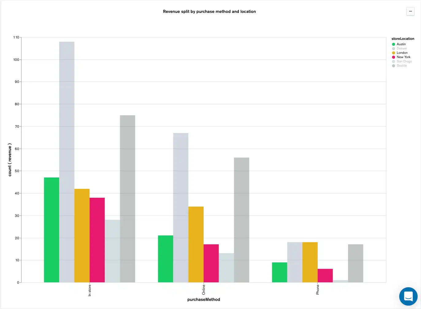
To emphasize multiple data series at once, shift-click as many labels in the legend as you would like. Charts adjusts the opacity of the selected data series from de-emphasized to emphasized.

Emphasize All Data Series
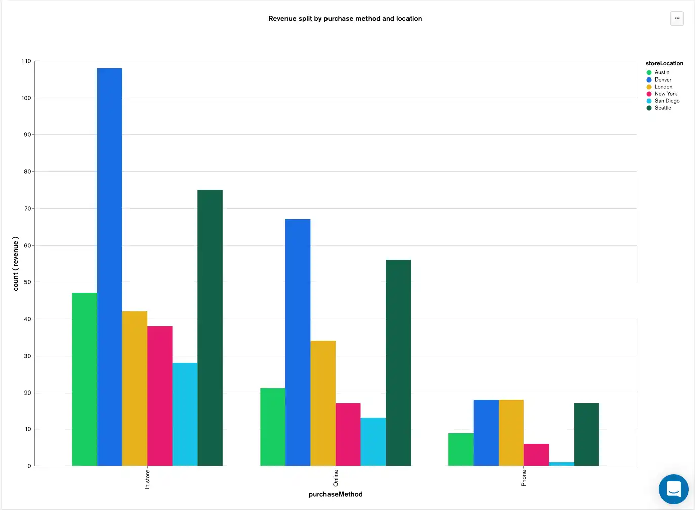
To restore the opacity of all data series to the default emphasized state, click the chart background.

Zoom and Pan a Scatter Chart
Chart viewers can zoom and pan a non-geospatial scatter chart.
Zoom
To zoom in or out of the chart, scroll up or down. Charts automatically adjusts the axis bounds to change the viewport, while keeping the plotted points the same size.
The resulting view after zooming and panning is only visible to you and does not persist page reloads. To revert back to the original axis bounds, reload the chart page.
Pan
To pan the chart, click and drag over the chart surface.
View the Percentage of the Whole
Chart viewers can hover on each data point to view the value as a percentage of the whole. The part to whole relationship appears in the tooltip for the data point. This behavior applies to any chart type that displays a part of the whole relationship, specifically:
For stacked charts, the whole value is the total value of the current category. For donut charts, the whole value is the total value of the entire chart.
Show Data for an Item
Chart viewers with Author or Owner data source permissions can view the original data that contributed to a chart element.
Chart viewers can show data for the following chart elements:
Bar or mark on a chart plot area
Chart legend entry
Category axis label
Table row
Choropleth shape
Note
Some charts (Geospatial Scatter Chart, Gauge Chart, and Top Item Chart) do not support this functionality.
To view the original data that contributed to a chart element, right-click on the chart element and select View data at point from the context menu. You can switch between the Table view and JSON view.
Interact with Data in the Table View
Chart viewers with Author or Owner data source permissions can resize and swap columns in the table view. Changes do not persist. Each column has a maximum width.
Note
The dialog for the Table view displays a maximum of 1,000 rows.
Interact with Data in the JSON View
Chart viewers with Author or Owner data source permissions can expand or collapse sections of the JSON document.
Note
The dialog for the JSON view displays a maximum of 100 documents only.
Copy and Save a Chart as an Image
Chart viewers can copy and save a chart as an image. The image file includes the chart contents, including the title of the chart.
Copy
To copy a chart to your clipboard as an image, right-click on the chart and select Copy chart as image from the context menu. You can copy any chart type except tables.
Note
The copy feature is not available on Firefox.
Save
To save a chart as a PNG file, right-click on the chart and select Save as PNG from the context menu.