Scatter charts plot data with individual data points placed along the X and Y axes. Optionally, the data point representations may use shapes and colors to display additional data dimensions.
Scatter Chart Encoding Channels
Scatter charts provide the following encoding channels:
Encoding Channel | Description |
|---|---|
X / Y Axis | The X and Y axis encoding channels accept numerical and date fields and display the range of values from the field along the corresponding axis. |
Size | (Optional) An aggregation encoding channel that changes the size of the data point markers, with larger sizes indicating larger aggregated values. To learn more, see Customize Mark Size. |
Color | (Optional) A category encoding channel that changes the color of the data point markers based on the value of the selected field. Atlas Charts lists the colors used in a key to the right of the chart. |
Shape | (Optional) A category encoding channel that changes the shape of the data point markers based on the value of the selected field. Atlas Charts lists the shapes used in a key to the right of the chart. |
Tooltip Detail | (Optional) A category encoding channel that adds the value of the selected field to each data point's tooltip. To view a data point tooltip, hover over that point in the chart. In addition to the Tooltip Detail field, the tooltip also shows other fields used to construct the chart. |
Use Cases
Scatter charts are useful for representing numerical data and showing clearly how data points cluster together in certain areas. The Size, Color, and Shape encoding channels allow you to reveal additional trends for data dimensions with low cardinality.
Tip
Scatter charts show an individual marker for each data point, so they work better with smaller result sets. Outliers and extreme data points are easy to identify.
Consider using a scatter chart to display:
Temperature data for selected cities
Volume of sales data for selected retail outlets
Population density figures across several countries
Customization Options
The following customization options are specific to scatter charts. To see all available customization options, see Customize Charts.
Opacity
The Opacity customization option, measured as a
percentage, modifies the transparency of the data point fill. This
setting defaults to 0%, which renders the data point fill as
completely transparent.
Stroke Thickness
The Stroke Thickness customization option, measured in
pixels, modifies the thickness of data point outlines. This setting
defaults to 2.
Mark Size
Adjust the size of the scatter marks. This option behaves differently based on whether you have a field mapped to the Size encoding channel.
If you do not have a field mapped to Size, the Mark Size setting changes the size of the marks linearly based on the chosen value.
If you have a field mapped to Size, the Mark Size setting changes the size of the largest mark, and also controls the difference between the smallest and largest marks.
Smart Date Labels
Smart labels for dates are axis markers grouped by units of time to reduce
repetition of information. They are generated automatically based on the range of
the chart when a date type field is encoded on an X or Y value axis.
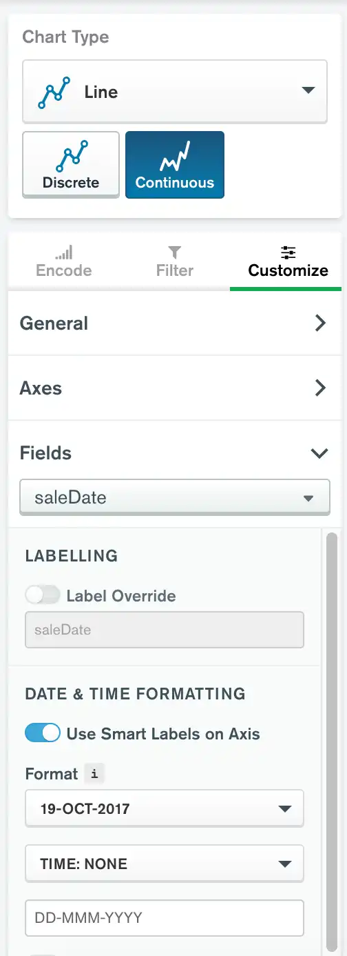
Smart labels are enabled by default when dates fields are encoded on value axes on supported chart types. To toggle smart labels on and off:
Click the Customize tab above the encoding channels in the Chart Builder.
Expand the Fields section.
Select the desired field from the dropdown menu.
If the Use Smart Labels on Axis toggle swich is set to Off, toggle it to On.

Note
When smart labels are enabled, date and time formatting options remain available. Any formatting options you apply are visible in the chart's tooltips.
Add a Trendline
You can add a trendline to a continuous line/area or scatter chart. To enable the trendline feature:
Open the Customize pane for your chart.
Scroll down to the Chart Elements section.
Toggle the Trendline switch.
If your chart has multiple series, select a series from the Series dropdown menu.
Select a trendline type from the Type dropdown menu.
Trendlines span the entire length of a chart's X axis, including any additional space added as a result of a min/max axis customization.
The following trendline types are available:
Linear (default)
Logarithmic
Quadratic
Cubic
Exponential
Power
The trendline option is not available if:
A field is mapped to the series channel.
A count by value aggregation is used.
Examples
AirBnB Rentals
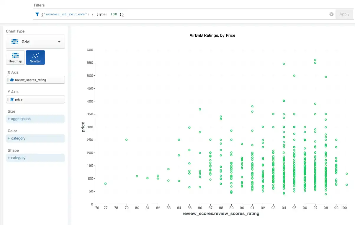
The following scatter chart uses a database of information about AirBnB rental properties in Sydney, Australia. The X axis shows the review ratings given to individual properties, with the price per night displayed along the Y axis. The query filter restricts the result set to properties with at least 100 reviews.
The chart shows that lower-priced properties have a wider range of review scores, while higher-priced properties have a smaller score range with generally higher scores.

Movies with the Most Award Nominations
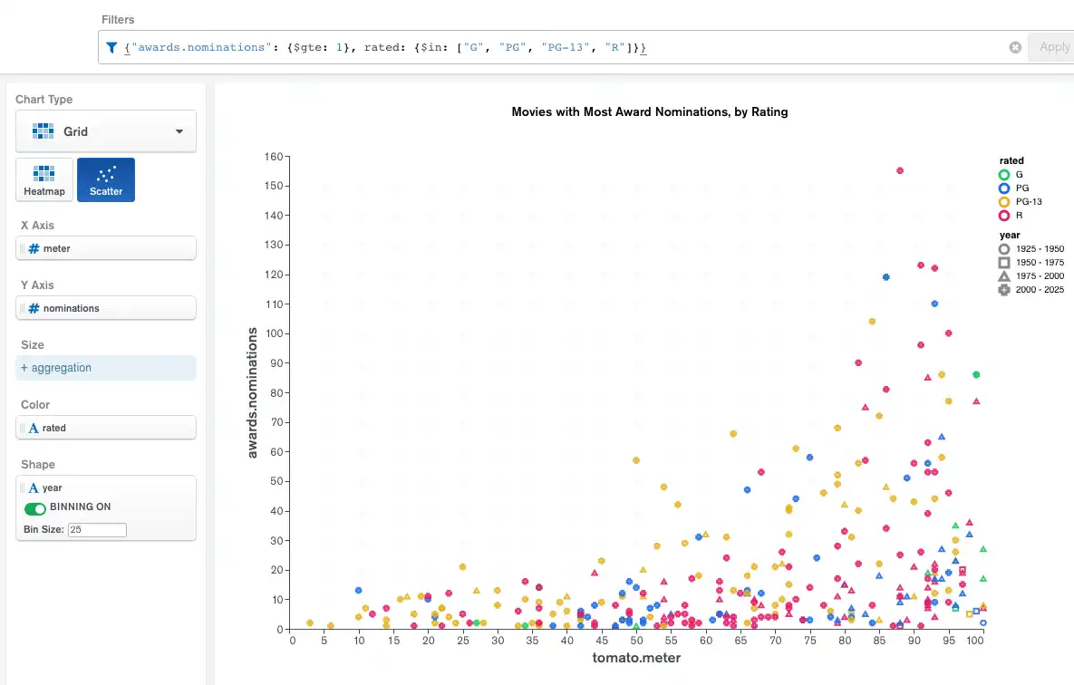
The following more complex scatter chart uses a database with movie data compiled from IMDb and Rotten Tomatoes. The chart shows the TomatoMeter rating (ranging from 0 to 100) of movies with at least one award nomination. Each data point marker represents one movie. The X axis shows the movie's TomatoMeter rating and the Y axis shows the number of award nominations the movie received.
The query filter restricts the result set to exclude marginal data points.
The chart uses the Color and Shape encoding channels to shed further light on the types of movies which receive the most award nominations. The color of each data point shows the MPAA (Motion Picture Association of America) rating the movie received. The chart uses the Shape encoding channel to indicate the year in which the movie was released, and bins the data to place each movie into a time range, with each bin covering 25 years. Without the bins, there would be a different shape for every year, which would make the chart too noisy to read.

Limitations
The maximum query response size for a scatter chart is 50000 documents.