Natural Language Charts
Natural language charts uses an AI model to create one of the charts listed below based on a prompt you provide.
Column and Bar Charts
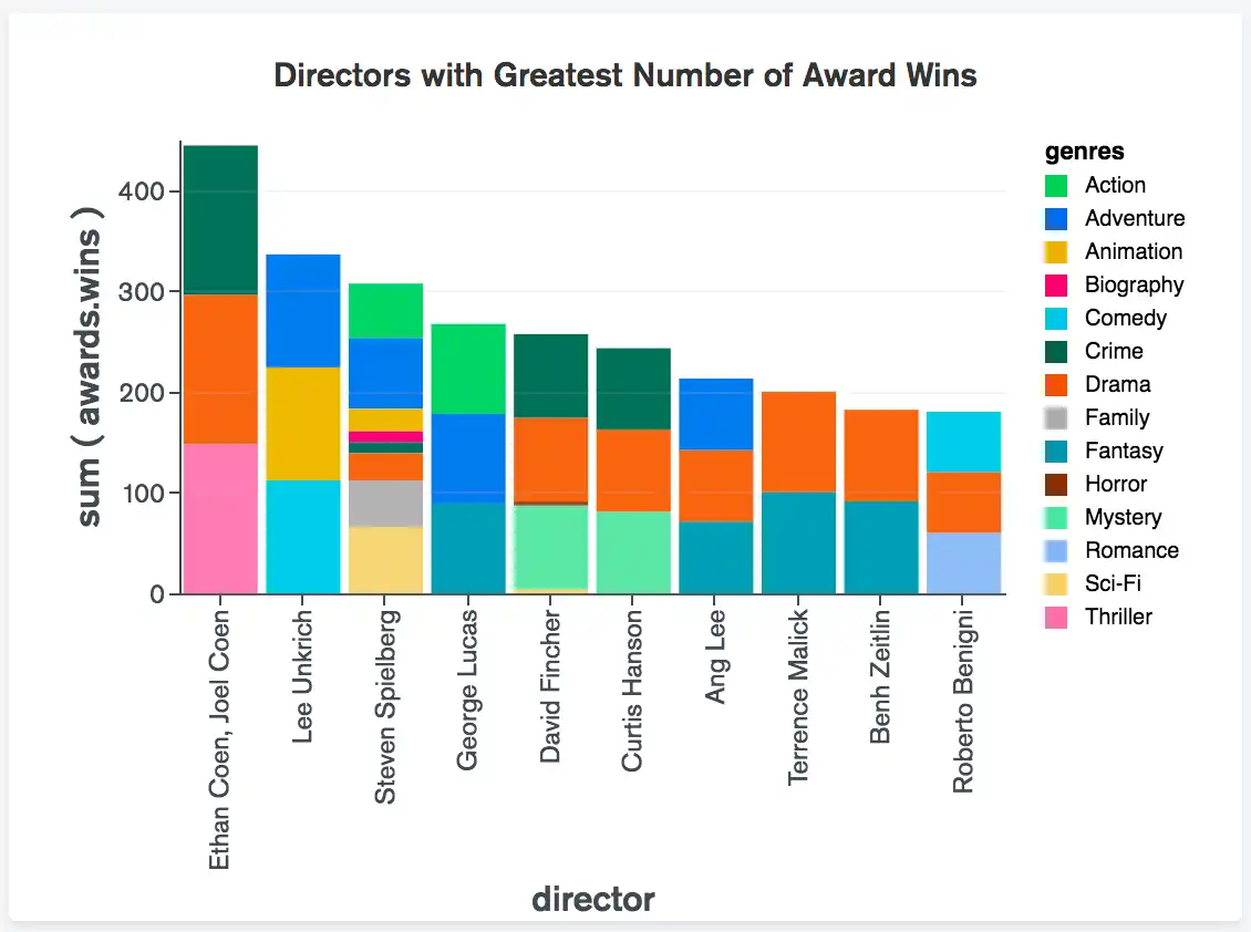
Column and Bar Charts provide high-level overviews of data trends by comparing values within a specific category.
Line and Area Charts
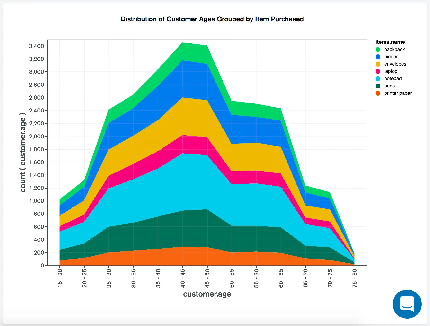
Line and Area Charts display information as a series of data points connected by straight line segments.
Combo Charts
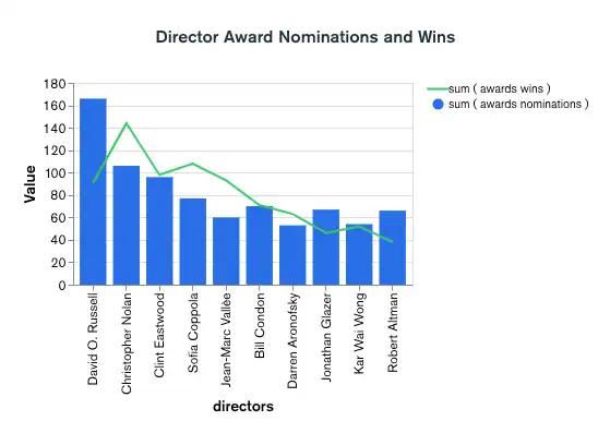
Combo Charts offer a combined column and line view.
Grid Charts
Heatmaps
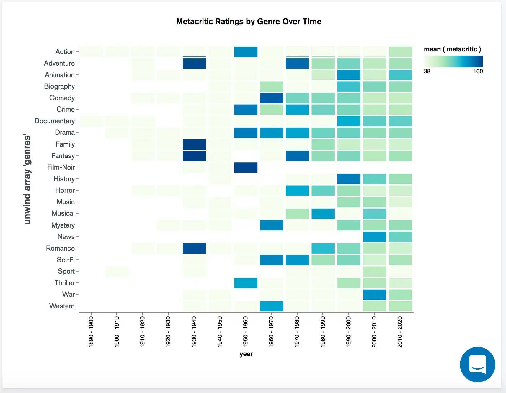
Heatmaps represent aggregated data in a tabular format as a range of colors.
Scatter Charts
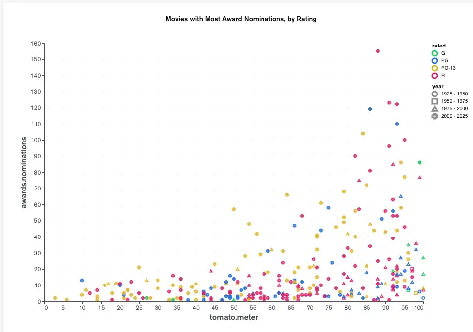
Scatter Charts plot data with individual data points placed along the X and Y axes.
Circular Charts
Donut Charts
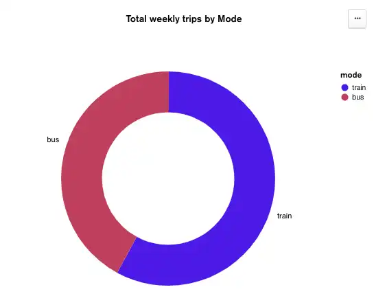
Donut Charts display data in a series of segments of a circle, with larger segments representing larger data values. The entire circle represents the sum of all data values, and each segment indicates the proportion of each category in the data to the total.
Gauge Charts
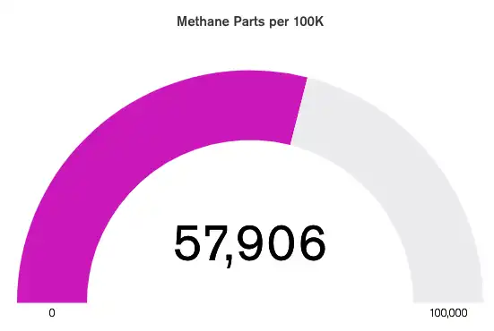
Gauge Charts display data as a percentage of a semicircle, with customizable minimum and maximum values. Optionally you may also specify a Target value, which renders as a heavy line within the gauge's range.
Text Charts
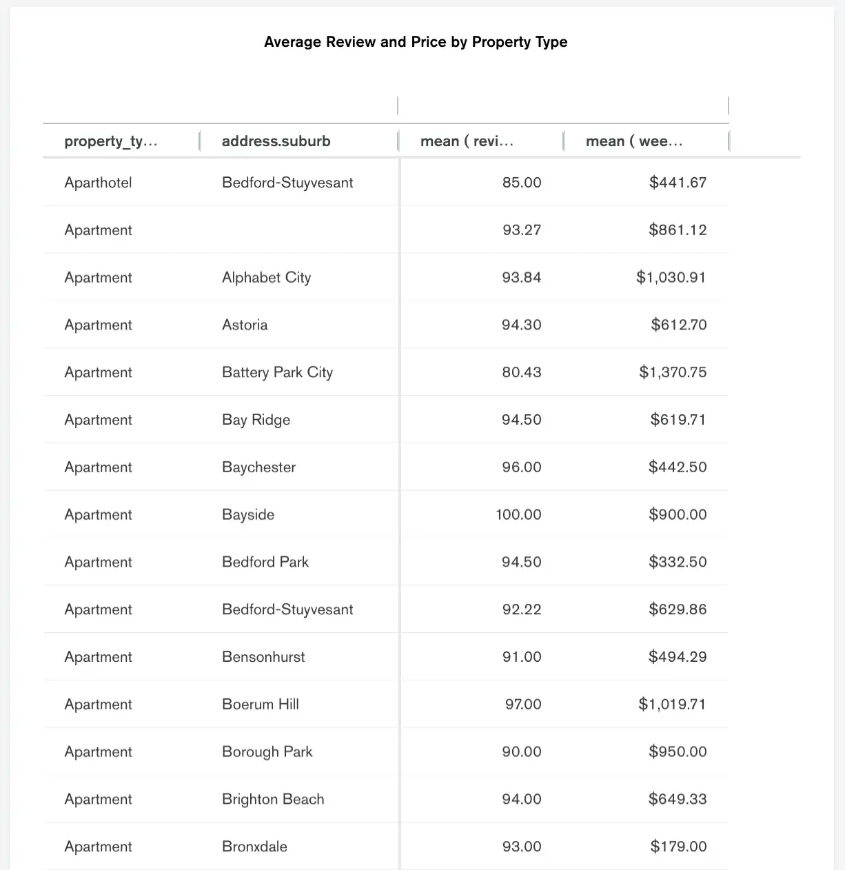
Tables
Tables represent data in a tabular view, similar to a spreadsheet.
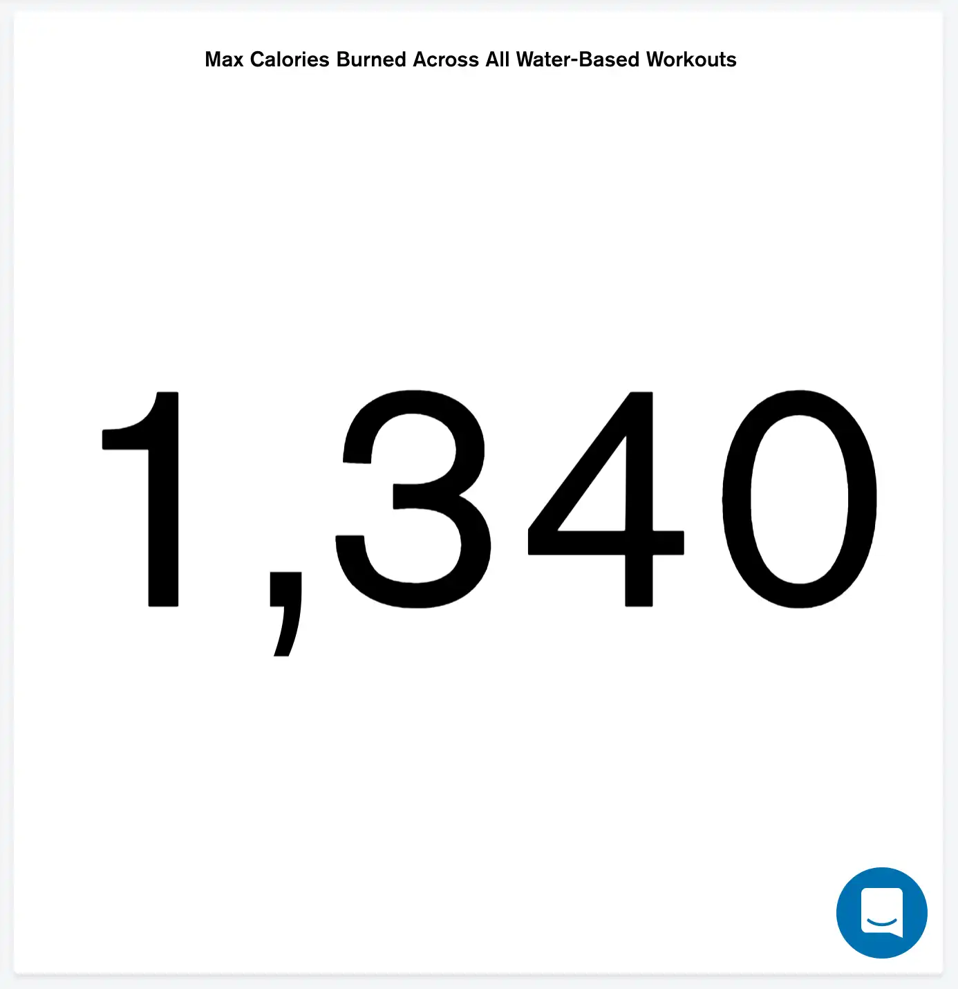
Number Charts
Number Charts display a single aggregated value from a data field.
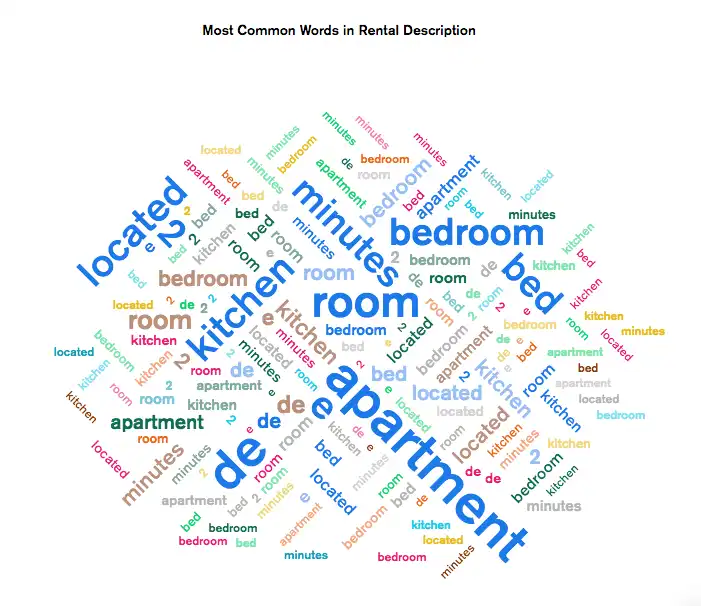
Word Clouds
Word Clouds visually represent text data, highlighting prevalent keywords and phrases.
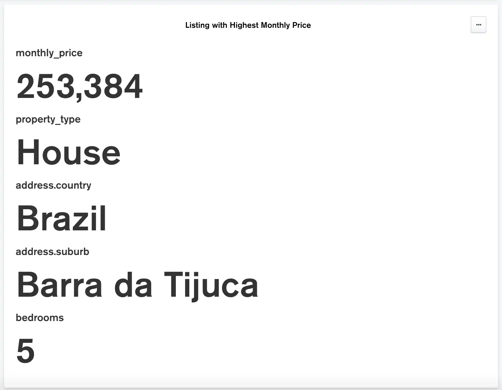
Top Item Charts
Top Item Charts display information from the document with the greatest or smallest value for a specified field.
Geospatial Charts
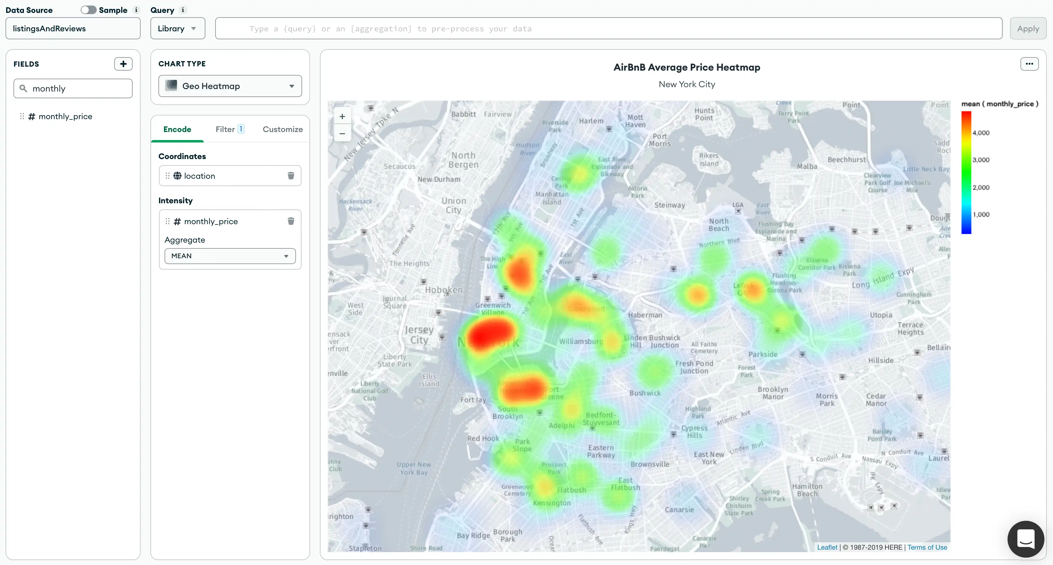
Geospatial Charts combine geospatial data with other forms of data to create map-based charts.
Maximum Document Limit
The maximum number of documents a chart displays data from differs
based on the chart type. The limit is enforced on the server using a
$limit stage at the end of the pipeline.
Once this maximum limit is reached, there is no way to determine which documents from the total data set comprise the chart data. A warning message is displayed that specifies the query response limit for that particular chart type.
Empty Charts
Empty Charts display charts with no chart data.
