Natural language charts simplifies the chart creation process. It supports the following chart types, which are built with series and aggregation encoding channels:
Grouped Bar
Stacked Bar
Stacked 100% Bar
Grouped Column
Stacked Column
Stacked 100% Column
Discrete Line
Discrete Area
Stacked 100% Area
Number
Table
Donut
These types of charts support boolean, date, string, and number filtering, sorting, binning, and limiting.
After you enter a prompt about a chart you would like to see, the AI model creates the chart.
Procedure
Go to the Dashboards page.
For instructions, see Dashboards.
Add a natural language chart.
From the Dashboards page, select the dashboard where you want to add a new chart. For instructions on setting up a dashboard, see Dashboards.
Click the Add Chart button.
In the Select Data Source modal, click the Project tab.
In the cluster where you loaded the sample data, select the
listingsAndReviewscollection in thesample_airbnbdatabase.Toggle the switch on the top navigation from Classic to Natural Language.
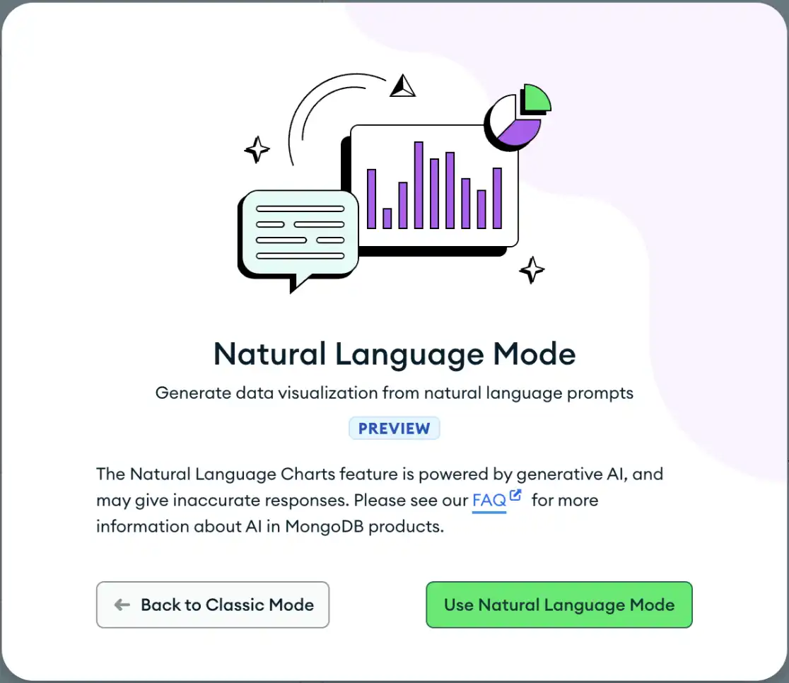
When you toggle this, you must click the Use Natural Language Mode button in the Natural Language Mode modal to accept the MongoDB Acceptable Use Policy and Privacy Policy.
![Natural Language Mode Modal]() click to enlarge
click to enlargeIf you click Back to Classic Mode, Atlas Charts switches you back to Classic mode.
Note
You can seamlessly switch between Classic and Natural Language mode. Atlas Charts retains the prompts and suggestions when you change modes as long as you keep the encoding and filter tabs the same in the chart builder.
Describe the chart you want to create.
In the Prompt box, specify the chart you want Atlas Charts to create.
We recommend that you write clear prompts and tag the fields from
your collection with @. The following list provides examples
of clear prompts:
Use a line chart to display trends in quarterly sales data.
Display monthly sales revenue for the last year.
Visualize weekly sales data in year 2022 using a discrete line chart.
Show the age distribution of our customers.
Show me the top 3 property_type and all other properties grouped together with the highest price.
Note
Your prompt cannot exceed 500 characters.
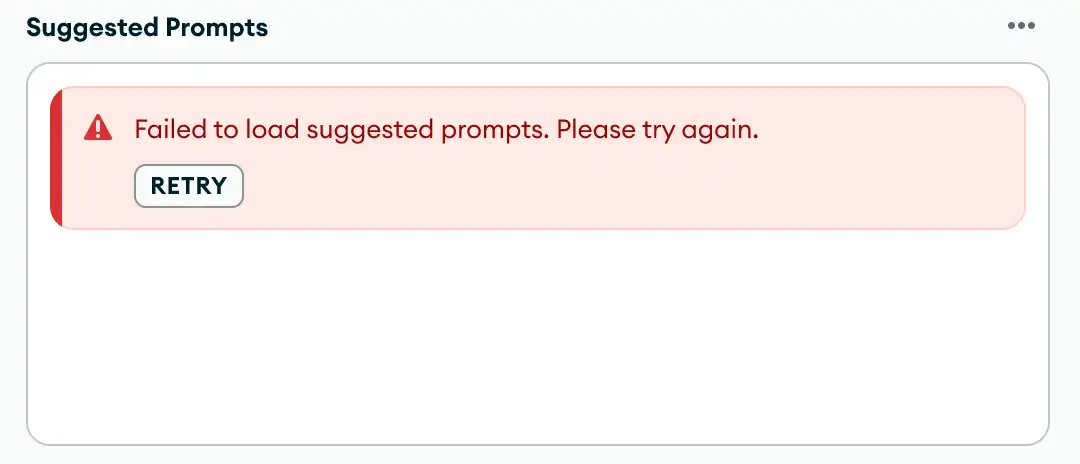
If you're unsure of what chart you would like to see, you can choose one of the Suggested Prompts and click Select.
Tip
If your Suggested Prompts section doesn't load, click Retry.

(Optional) Customize your chart.
To customize your chart, toggle the switch on the top navigation from Natural Language to Classic.
Disable AI Features
If you want to prevent users in your project from using AI features, disable the AI feature:
Go to the AI Features page.
Click AI features under the Settings heading in the sidebar.
The AI Features page displays.
If you want to prevent users in your organization from using AI features, disable the AI feature:
In Atlas, go to the Organization Settings page.
If it's not already displayed, select your desired organization from the Organizations menu in the navigation bar.
Click the Organization Settings icon next to the Organizations menu.
The Organization Settings page displays.
To learn more, see New Intelligent Developer Experiences Compass Atlas Charts Relational Migrator and AI and Data Usage Information.
