Line charts and area charts display information as a series of data points connected by straight line segments. In area charts, the space beneath the line segments is filled in with color, whereas in line charts only the line segments are rendered with no additional coloring or shading. These charts facilitate visualizing data over a period of time (using time series data) and identifying trends and patterns across the entire data range. Line and area charts support visualizing both discrete and continuous data.
Discrete Line and Area Charts
Discrete line and area charts visualize categorical or binned data with some form of logical ordering, such as time. Atlas Charts always aggregates values in discrete charts such that any number of documents can supply values to a given plotted point. A discrete chart would be useful to visualize a store's average annual sales over time.
Discrete Chart Encoding Channels
Discrete line and area charts provide the following encoding channels:
Encoding Channel | Description |
|---|---|
X Axis | The category encoding channel. Atlas Charts renders a data point for each unique value from the field assigned to this encoding channel. |
Y Axis | The aggregation encoding channel. This channel dictates which field to aggregate on and the type of aggregation to perform. This ultimately dictates the position of each category's data point on the chart. Categories are defined by the X Axis encoding channel. You can aggregate upon multiple fields in your dataset to create multi-series charts. For more information, see Multiple Field Mappings. |
Series | (Optional) Adds an additional category encoding channel to the visualization. When utilized, Atlas Charts adds an additional line to the visualization for each unique value in this field. Use this field to map additional discrete categorical fields in your data, rather than multiple aggregated fields. This option is only available when there is a single field mapped to the Y Axis aggregation encoding channel. |
100% Stacked Area Charts
100% stacked area charts are a subtype of discrete area charts. In 100% stacked area charts, the total area shown is normalized to 100% and split into segments based on the category in the Series encoding channel. Each series is shown as a percentage of the whole.
When using a traditional stacked area chart, it can be difficult to compare the proportions of each series to the whole if the total value of the chart segments greatly differ. 100% stacked charts make it easier to compare proportions of each series to the whole by showing relative percentages.
For a detailed example, see the 100% Stacked Area Chart Example.
Continuous Line and Area Charts
In continuous line and area charts, every data point comes from a distinct document in the data source. Continuous charts do not support aggregation or binning. A continuous chart would be useful to visualize stock closing prices over time, assuming each closing price comes from a distinct document in the dataset.
Continuous Chart Encoding Channels
Continuous line and area charts provide the following encoding channels:
Encoding Channel | Description |
|---|---|
X Axis | Atlas Charts renders a data point for the values in this field from each document in the collection. |
Y Axis | For each document in the data source, Atlas Charts compares the value of this field against the X Axis field and plots the resulting value. You can add multiple value encoding channels to the chart's Y Axis to create multi-series charts. For more information, see Multiple Field Mappings. |
Series | (Optional) Adds an additional category encoding channel to the visualization. When utilized, this field adds an additional line to the visualization for each unique value in this field. This option is only available when there is a single field mapped to the Y Axis aggregation encoding channel. |
Smart Date Labels for Continuous Line and Area Charts
Smart labels for dates are axis markers grouped by units of time to reduce
repetition of information. They are generated automatically based on the range of
the chart when a date type field is encoded on an X or Y value axis.
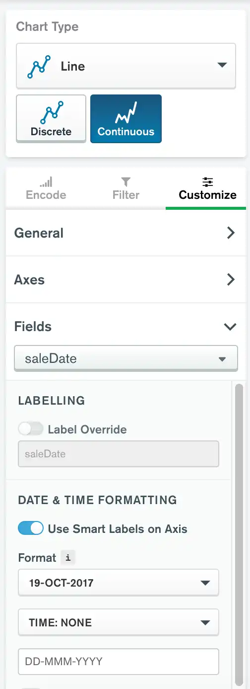
Smart labels are enabled by default when dates fields are encoded on value axes on supported chart types. To toggle smart labels on and off:
Click the Customize tab above the encoding channels in the Chart Builder.
Expand the Fields section.
Select the desired field from the dropdown menu.
If the Use Smart Labels on Axis toggle swich is set to Off, toggle it to On.
Note
When smart labels are enabled, date and time formatting options remain available. Any formatting options you apply are visible in the chart's tooltips.
Discrete Area Versus Continuous Area Charts Display
Discrete area charts are stacked, meaning Atlas Charts plots each series above or below the others in the visualization. The chart shows the total aggregated value of all of the series, so you can easily see the proportion of each series in relation to the total.
Continuous area charts are overlaid, meaning Atlas Charts plots each series directly on top of one another in the visualization.
Use Cases
Line charts and area charts are closely related and are both useful for depicting time series data and data with logical ordering. However, there are scenarios when it may be beneficial to use one chart type over the other.
Consider using a line chart when creating multi-series charts where each series represents an isolated field. Atlas Charts stacks multi-series area charts, as shown in this example, which results in a chart where the stacked totals appear to share a relationship contributing to a larger summed value. This may not be desireable depending on the specific relationships within the data fields.
The line chart displays the data from each series in-line with one another without stacking, which may provide a more accurate representation of the data as shown in the discrete line chart.
Area charts are useful for showing an overall trend while also highlighting relative performances of individual components of that sum.
Consider using a discrete area chart when illustrating a part-to-whole relationship, such as tracking data metrics over time. An example of this might be showing
revenuecompared withexpensesover the course of a year.A continuous area chart would work in this scenario if you were less concerned with the summation of the two fields and instead wanted a more direct comparison of the fields against one another.
Tip
When your data does not have a logical order, consider instead using a bar or column chart to visualize your data. When the order of the data is not important, a bar or column chart can quickly highlight the highest and lowest values in the visualization, which may be more beneficial than suggesting the viewer read the chart from left to right as in a line or area chart.
Customization Options
The following customization options are specific to line and area charts. To see all available customization options, see Customize Charts.
Adjust X-Axis Label Angle
You can adjust the X-axis label angles in Discrete Area Chart with Multiple Series and Discrete Line Chart with Multiple Aggregated Fields charts.
You can adjust the X-axis label angle to one of the following options:
Option | Description |
|---|---|
Vertical | Labels right-aligned at a 270 degree angle. |
Horizonal | Labels center-aligned at a 0 degree angle. |
Diagonal | Labels right-aligned at a 315 degree angle. |
To set this option:
Click the Customize tab for your chart.
In the Axes section, select a Label Angle for the X Axis.
Show or Hide Data Markers
On line and area charts, you can dictate whether Charts displays visible data markers that represent individual data points. Enabling this option makes it easier to see exactly where your data points lie along a line. Hovering over these markers shows the exact data values in a tooltip, making it easier to view precise measurements.
To set this option:
Open the Customize pane for your chart.
In the General section, set the Data Markers toggle switch to the desired setting.
To customize the formatting of the number in the data marker tooltip, modify the Number Formatting settings for the relevant field.
Set Distinct Dash Style per Series on Line Charts
On discrete and continuous line charts, you can opt to display each series in the chart with a distinct dash style. This option can help make your chart more accessible by distinguishing between series beyond color.
To set this option:
Open the Customize pane for your chart.
In the General section, set the Dash Styles per Series toggle switch to the desired setting.
Show or Hide Data Value Labels
You can dictate whether Charts displays text labels for your data values. Data value labels show the exact values of your data points.
To set this option:
Open the Customize pane for your chart.
In the General section, set the Data Value Labels toggle switch to the desired setting.
To customize the formatting of the number in the data label, modify the Number Formatting settings for the relevant field.
Note
When used with stacked column and bar charts, data labels show the sum of all series in each column or bar.
Add a Trendline
You can add a trendline to a continuous line/area or scatter chart. To enable the trendline feature:
Open the Customize pane for your chart.
Scroll down to the Chart Elements section.
Toggle the Trendline switch.
If your chart has multiple series, select a series from the Series dropdown menu.
Select a trendline type from the Type dropdown menu.
Trendlines span the entire length of a chart's X axis, including any additional space added as a result of a min/max axis customization.
The following trendline types are available:
Linear (default)
Logarithmic
Quadratic
Cubic
Exponential
Power
The trendline option is not available if:
A field is mapped to the series channel.
A count by value aggregation is used.
Smooth Lines
You can change the way lines are drawn on your chart. To smooth lines:
Open the Customize pane for your chart.
In the General section, set Line Smoothing to the desired option.
The following line smoothing options are available:
Option | Description |
|---|---|
None (Default) | Draws straight lines between data points. |
Smooth | Draws curved lines between data points. |
Step Before | Lines extend horizontally to data points. This is useful for visualizing data that only changes in intervals and is collected at the end of a period, such as daily average temperature. |
Step After | Lines extend horizontally from data points. This is useful for visualizing data that only changes in intervals, such as stock prices. |
Examples
Discrete Area Chart with Multiple Series
The following chart visualizes sales data from a mock office supply store. Each document in the collection represents an individual sale with information on the item(s) sold and the customer conducting the purchase. This discrete area chart shows the distribution of customer ages throughout sales in the collection:
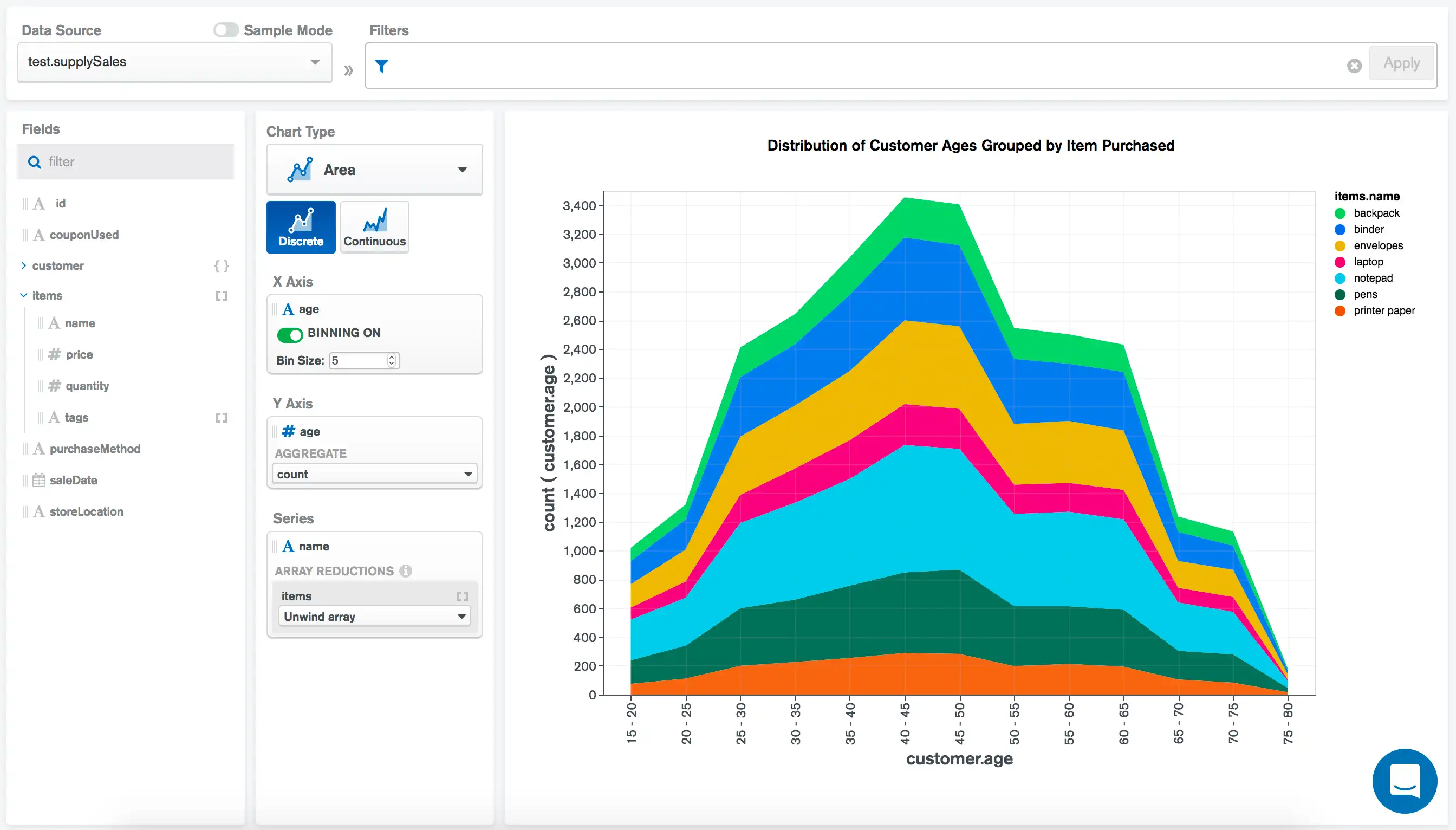
The X Axis field of customer.age plots the ages of the
customers along the X axis. We direct to Charts to bin the ages into groups of 5.
The Y Axis field of customer.age and
aggregate option of count counts the
occurrences of each age in the corresponding bin.
Lastly, we apply the item.name field to the
Series encoding channel to split the age area into
segments displaying the count of each age group purchasing each
store item.
Note
For more information on multi-series charts, see Multi-Series Charts.
100% Stacked Area Chart
The following chart visualizes data from a mock office supply store. Each document in the collection represents an individual sale with information on the item(s) sold and the customer conducting the purchase. This 100% stacked area chart shows the relative percentages of items sold on each date of the month:
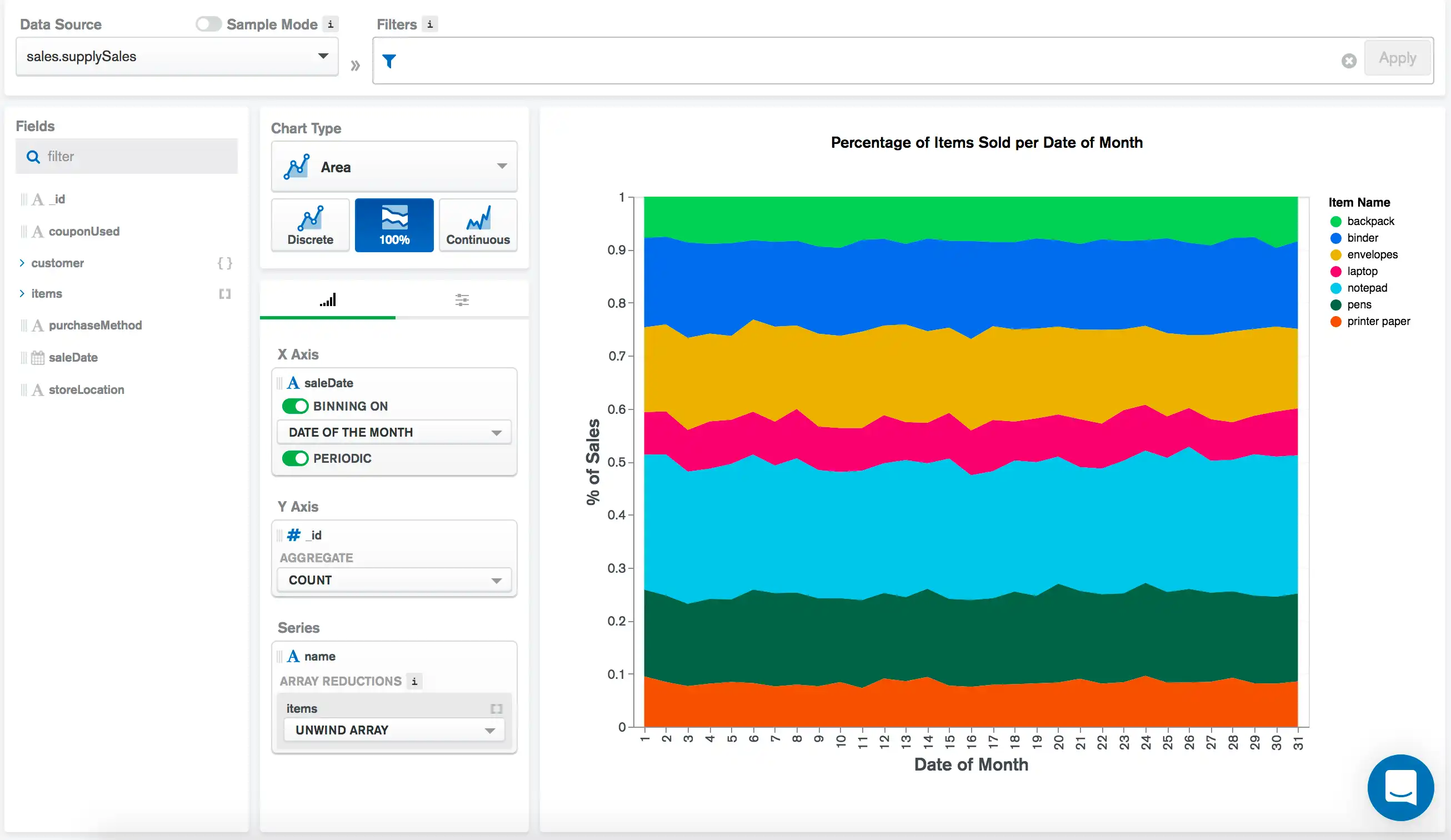
The X Axis field of saleDate plots each sale
according to its date. The Binning and
Periodic settings are enabled, so
Charts groups the dates into bins based on each date of the
month.
Note
For more information on binning dates and the periodic setting, refer to the Bin Data page.
The Y Axis field of _id runs a count aggregation to calculate the
total number of sales that happened each day of the month. Since this
is a 100% stacked chart, these values are all normalized to 100%, and
are segmented by the Series encoding channel.
The Series field of item.name segments the total chart
area based on the name of the item sold. Since there may
be multiple items in a single document, we Unwind this
array to add each item to the visualization. This provides a clear
picture of the relative percentages of items sold based on the
date of the month.
Discrete Line Chart with Multiple Aggregated Fields
The following chart visualizes data pertaining to movies. Each
document in the collection represents a movie and contains general
information about the film and ratings from various rating
aggregators. This discrete line chart compares average
Rotten Tomatoes
tomato.meter ratings and average Metacritic ratings of films over time. Both ratings
are on a scale from 0 - 100:
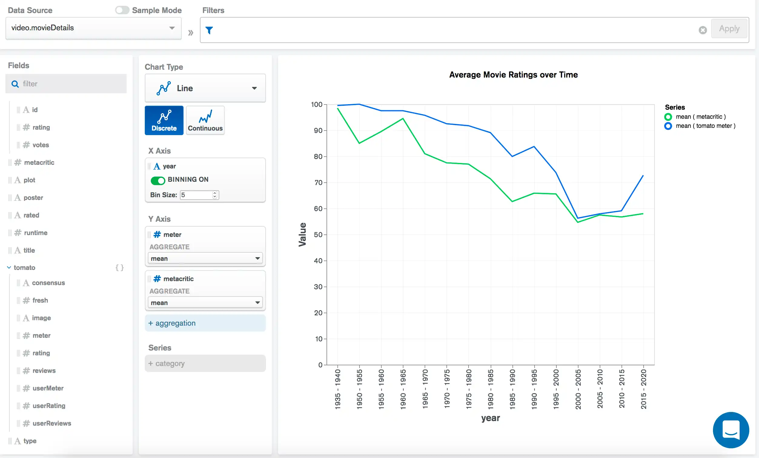
The X Axis field of year plots each film according to
its release year. We direct to Charts to bin the years into groups of 5.
The Y Axis fields of tomato.meter and metacritic
along with the aggregate option of mean
calculate and plot the average ratings of films from each
group of 5 years.
Note
For more information on creating charts with multiple aggregated fields, see Multiple Field Mappings.
Continuous Line Chart Using Time Series Data
The following chart visualizes data pertaining to the usage of a solar-powered house battery. This continuous line graph shows the battery level over time:
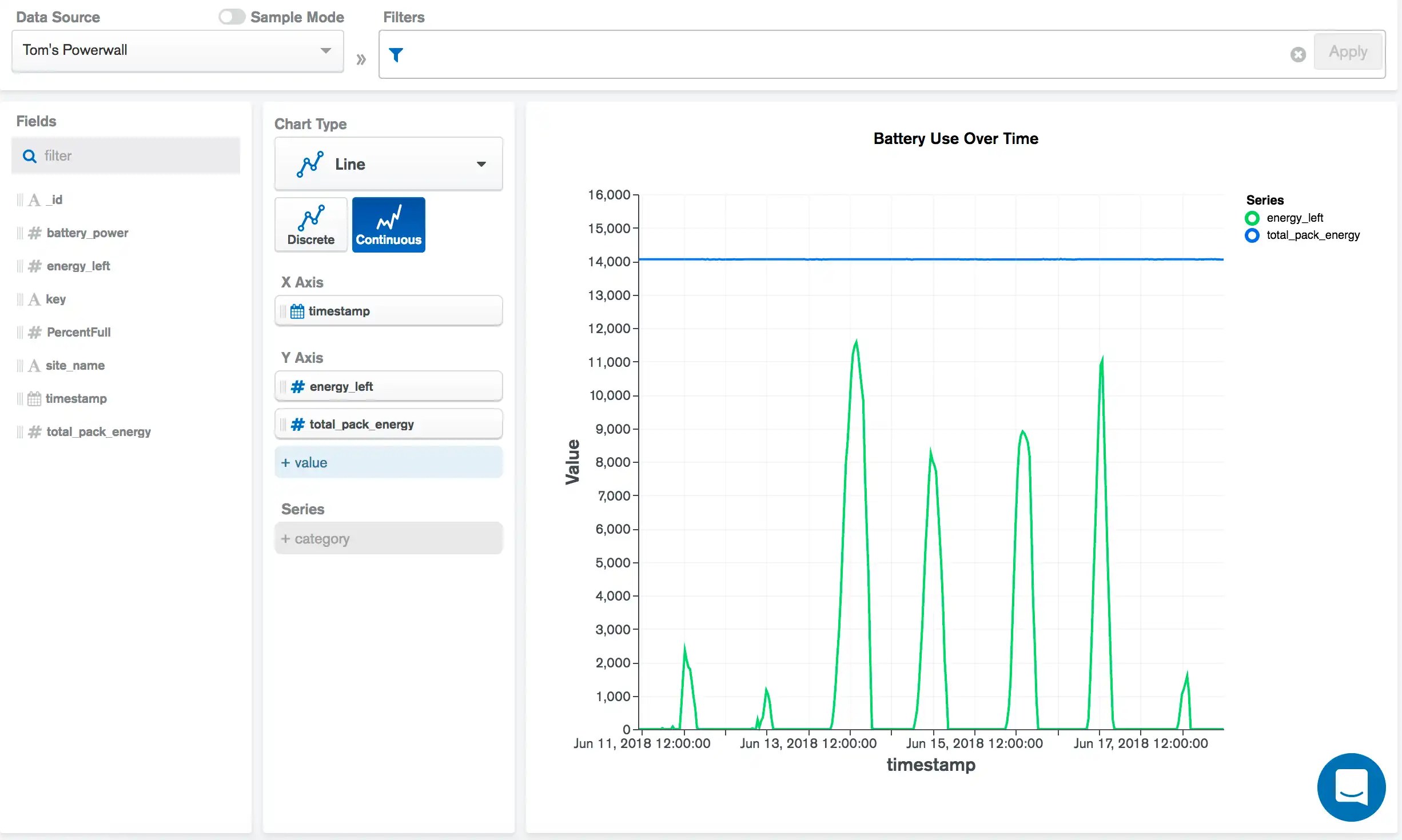
The X Axis field of timestamp plots each timestamp in
the data source. The Y Axis fields of energy_left and
total_pack_energy each plot a series in the chart; the amount of
energy the battery has left and the total amount of energy the battery
holds. This comparison shows how close the battery is to a full charge.
Note
A continuous chart works better than a discrete chart in this case
because our X Axis field, timestamp is not a
discrete, categorical variable, and is instead a continuous value
along a range. We want to plot each timestamp as an individual
point, rather than show an aggregated value from many data values.
Limitations
The maximum document limit for discrete line and area charts is 5000 documents.
The maximum document limit for continuous line and area charts is 50000 documents.