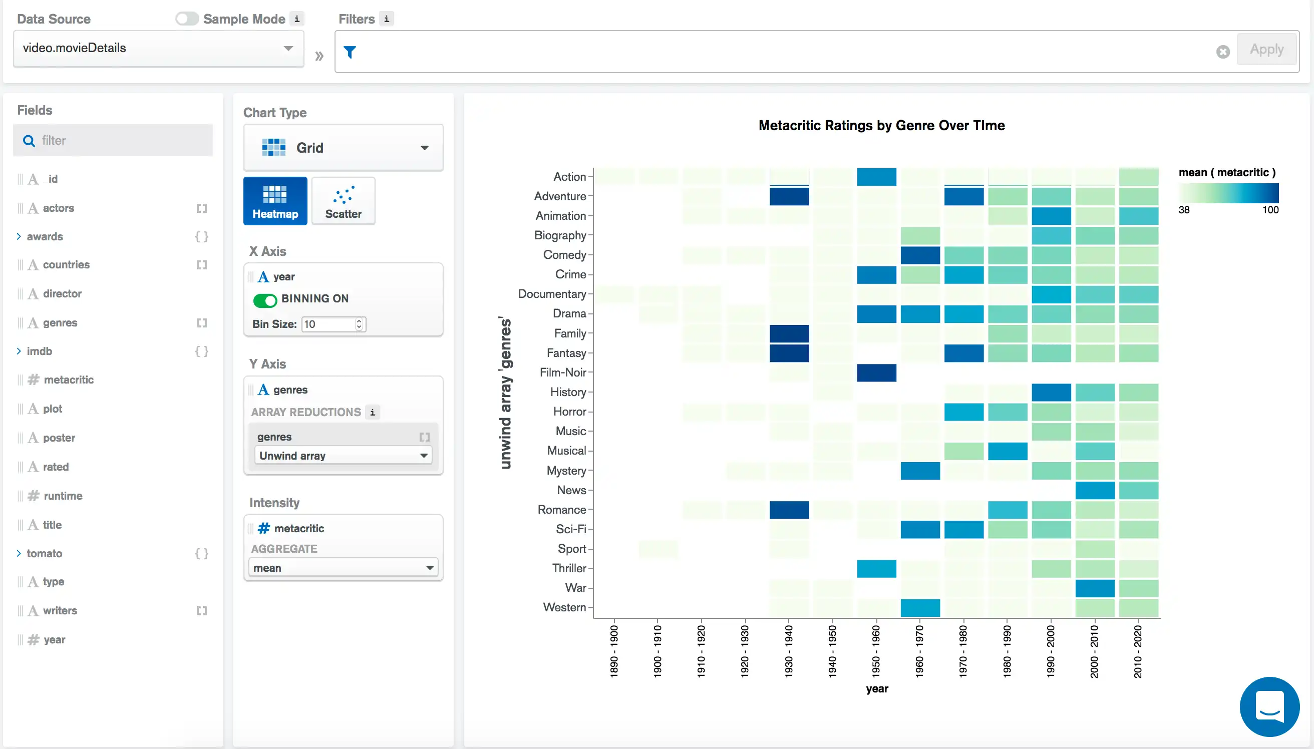
A heatmap represents data in a tabular format as a range of color. A darker, or more intense, color represents a larger aggregated value for a particular data point.
Heatmap Encoding Channels
Heatmaps provide the following encoding channels:
Encoding Channel | Description |
|---|---|
X Axis | A category encoding channel that creates a category along the X axis for each unique value in this field. |
Y Axis | A category encoding channel that creates a category along the Y axis for each unique value in this field. |
Intensity | An aggregation encoding channel that changes the shading of the colors in different chart regions to reflect the aggregated values of this field. More intense colors in the visualization reflect greater aggregated values. |
Use Cases
Heatmaps reveal patterns or trends within your data. Use heatmaps when the exact data values are not as important as depicting higher-level trends and relationships between your data points. They can also highlight any significant outliers, or points which strongly go against the general direction of your data. A heatmap is a good choice to display:
A comparison of average room rental prices based on location and property type.
Geographic data, such as election results across different districts or population density.
The number of customer orders across various store locations by month of the year.
Tip
Heatmaps work especially well with binned data. With naturally ordered datasets, heatmaps highlight areas of concentration within the data.
Customization Options
The following customization options are specific to heatmap charts. To see all available customization options, see Customize Charts.
Adjust X-Axis Label Angle
You can adjust the X-axis label angle to one of the following options:
Option | Description |
|---|---|
Vertical | Labels right-aligned at a 270 degree angle. |
Horizonal | Labels center-aligned at a 0 degree angle. |
Diagonal | Labels right-aligned at a 315 degree angle. |
To set this option:
Click the Customize tab for your chart.
In the Axes section, select a Label Angle for the X Axis.
Examples
The following chart visualizes data pertaining to movies. Each document in the collection represents a movie and contains general information about the film as well as ratings from critics. This heatmap shows the mean (average) Metacritic rating for different movie genres (Y Axis) over time (X Axis):

We bin the years along the X Axis into
decades and aggregate to find the mean metacritic score
of films from each genre released in each decade.
The intensity field of metacritic shades each grid
element based on the mean metacritic field of all of the
intersecting documents based on the X and
Y axes fields. Based on the chart, we see that
from 1930-1940 there are a few genres with very high
average Metacritic scores, and over time a more even distribution of
film ratings begins to occur.
Note
If the space is white, there are no movies from that decade of that particular genre in the dataset.
Limitations
The maximum query response size for a heatmap is 20000 documents.