Donut Charts display data in a series of segments of a circle, with larger segments representing larger data values. The entire circle represents the sum of all data values, and each segment indicates the proportion of each category in the data to the total.
Donut Chart Encoding Channels
Donut charts provide the following encoding channels:
Encoding Channel | Description |
|---|---|
Label | |
Arc | The aggregation encoding channel. Atlas Charts aggregates this field based on the aggregation method selected. This field dictates the size of each circle segment. If you don't add a field to the Label channel, you can add multiple fields to the Arc channel. Atlas Charts creates one segment for each encoded field. |
Use Cases
Donut charts are ideal for giving readers a quick overview of the proportional distribution of a dataset. Use donut charts when the general trend of data is more important than precise data values. Donut charts are especially useful when there is a low number of categories to visualize, because it is easier to compare fewer segments of the circle to see which values make up the greatest parts of the whole.
Consider using donut charts to display:
The proportion of store customers who place orders in-store versus online
The proportion of various resources exported by a country
The choices thrown during several Rock, Paper, Scissors games
Note
Although you can limit your data to reduce the number of categories in the visualization, this may not be the best choice for donut charts. The purpose of donut charts is to show each value as a proportion of a total, so excluding categories may result in a misleading visualization that reflects inaccurate proportions.
If you do limit your data, donut charts enable the Show "All Others" option by default. This option creates an "All others" category that represents the sum of the omitted values and ensures that chart values are displayed as a proportion of the total.
When looking to compare individual data values, rather than show values as a proportion to a whole, consider using a column or bar chart.
Customization Options
The following customization options are specific to donut charts. To see all available customization options, see Customize Charts.
Show or Hide Category Labels
You can dictate whether Charts displays text labels for categories in your donut charts.
To set this option:
Open the Customize pane for your chart.
In the General section, set the Data Category Labels toggle switch to the desired setting.
Note
When you enable one or both of the Data Value Labels or Data Category Labels settings on a Donut Chart with many categories, Charts only renders labels for the highest value categories.
Show or Hide Data Value Labels
You can dictate whether Charts displays text labels for your data values. Data value labels show the exact values of your data points.
To set this option:
Open the Customize pane for your chart.
In the General section, set the Data Value Labels toggle switch to the desired setting.
To customize the formatting of the number in the data label, modify the Number Formatting settings for the relevant field.
Note
When used with stacked column and bar charts, data labels show the sum of all series in each column or bar.
Show Value or Percentage Labels
You can dictate whether a Donut Chart displays data values as raw values or percentages. By default, data value labels show the raw values of your data points. For percentage values in Donut Charts, the whole value is the total value of the entire chart. Percentage labels are always rounded to one decimal place, and do not adhere to Number Formatting settings.
To set this option:
Open the Customize pane for your chart.
In the General section, set the Data Value Labels toggle switch to on if off.
Select Show Value or Show Percentage from the drop-down.
Examples
Donut Chart Using Count
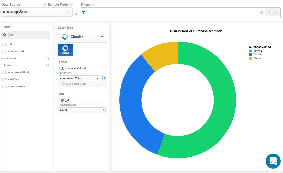
The following chart visualizes sales data from a mock office supply store. Each document in the collection represents an individual sale, which contains information on the item(s) sold and the customer conducting the purchase. This donut chart shows the proportional counts of the three different purchase methods the store provides:

The Label field of purchaseMethod tells Atlas Charts to
create a circle segment for each unique value in the purchaseMethod
field. Atlas Charts proportions each segment according to the aggregated
value signified in the Arc encoding channel. In this case,
we aggregate to find the total count of documents with the
same purchaseMethod value.
We see based on the visualization that the most common purchase method
is In store, followed by Online.
Note
In this example we are counting entire documents, so it does not matter what field we select for the Arc field. No matter what field we apply, the visualization will still be the same.
Donut Chart Using Sum
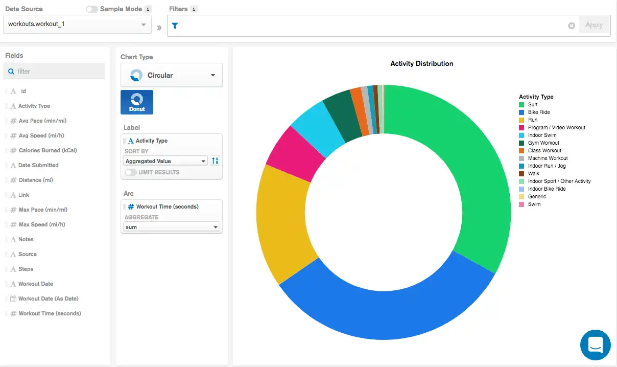
The following chart visualizes personal workout data. Each document in the collection represents a single workout activity, which includes information on the type of activity performed and the amount of time spent exercising. This donut chart shows the proportional time spent performing each exercise activity:

The Label field of Activity Type tells Atlas Charts to
create a circle segment for each unique value in the Activity Type
field. Atlas Charts proportions each segment according to the aggregated
value signified in the Arc encoding channel. In this case,
we aggregate to find the total sum of workout times for
documents with the same Activity Type value.
We see based on the visualization that the activity with the greatest
total workout time is Surf, followed by Bike Ride.
Donut Chart Using Multiple Arc Fields
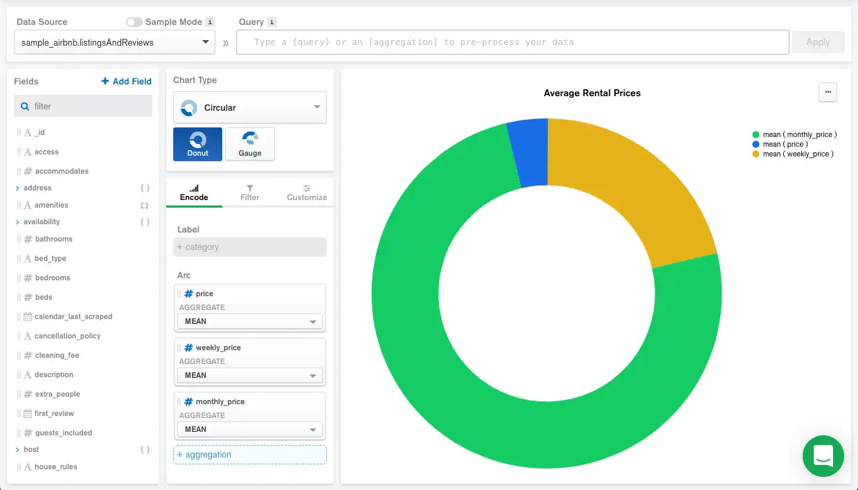
The following chart visualizes rental property data. Each document in the collection represents a single rental property, which includes information on prices. This donut chart shows the average price of all properties in the collection for a daily, weekly, and monthly rental:

Because there is no Label field, Atlas Charts creates a circle segment for each Arc field. Atlas Charts proportions each segment according to the aggregated value signified in the Arc encoding channel. In this case, we aggregate the mean price for all properties rented by the day, week, and month.
Limitations
The maximum query response size for a donut chart is 5000 documents.