Combo charts offer a combined column and line view.
Combo Chart Encoding Channels
Combo charts provide the following encoding channels:
Encoding Channel | Description |
|---|---|
X Axis | In the category axis encoding channel, a column is rendered for each unique value from this field. |
Columns |
You can map multiple fields to this channel to create a multi-series chart. However, unlike other charts, you can't create a multi-series chart with the Series channel on combo charts. To learn more, see Multiple Field Mappings. |
Lines |
|
Combo Chart Types
Combo charts provide the following sub-types:
Sub-Type Name | Description |
|---|---|
Atlas Charts groups data by the category specified in the category encoding channel, and plots a column for each value in the Columns encoding channel. | |
Atlas Charts creates a column for each distinct value in the category encoding channel field, and splits each column into segments based on the the Columns encoding channel. |
Use Case
Combo charts bring together the useful aspects of both column and line charts into a single chart.
Customization Options
The following customization options are specific to combo charts. To see all available customization options, see Customize Charts.
Note
If the columns and lines in your combo use different scales, consider a Secondary Y Axis. This option appears on the Customize pane in the Fields section for any fields mapped to the Lines channel. Fields mapped to the Columns channel appear only on the primary axis.
Adjust X-Axis Label Angle
You can adjust the X-axis label angle to one of the following options:
Option | Description |
|---|---|
Vertical | Labels right-aligned at a 270 degree angle. |
Horizonal | Labels center-aligned at a 0 degree angle. |
Diagonal | Labels right-aligned at a 315 degree angle. |
To set this option:
Click the Customize tab for your chart.
In the Axes section, select a Label Angle for the X Axis.
Set Distinct Dash Style per Series
On combo charts, you can opt to display each series in the chart with a distinct dash style. This option can help make your chart more accessible by distinguishing between series beyond color.
To set this option:
Open the Customize pane for your chart.
In the General section, set the Dash Styles per Series toggle switch to the desired setting.
Smooth Lines
You can change the way lines are drawn on your chart. To smooth lines:
Open the Customize pane for your chart.
In the General section, set Line Smoothing to the desired option.
The following line smoothing options are available:
Option | Description |
|---|---|
None (Default) | Draws straight lines between data points. |
Smooth | Draws curved lines between data points. |
Step Before | Lines extend horizontally to data points. This is useful for visualizing data that only changes in intervals and is collected at the end of a period, such as daily average temperature. |
Step After | Lines extend horizontally from data points. This is useful for visualizing data that only changes in intervals, such as stock prices. |
Show or Hide Data Markers
On combo charts, you can dictate whether Charts displays visible data markers that represent individual data points along the line. Enabling this option makes it easier to see exactly where your data points lie along a line. Hovering over these markers shows the exact data values in a tooltip, making it easier to view precise measurements.
To set this option:
Open the Customize pane for your chart.
In the General section, set the Data Markers toggle switch to the desired setting.
To customize the formatting of the number in the data marker tooltip, modify the Number Formatting settings for the relevant field.
Show or Hide Data Value Labels
You can dictate whether Charts displays text labels for your data values. Data value labels show the exact values of your data points.
To set this option:
Open the Customize pane for your chart.
In the General section, set the Data Value Labels toggle switch to the desired setting.
To customize the formatting of the number in the data label, modify the Number Formatting settings for the relevant field.
Note
When used with stacked column and bar charts, data labels show the sum of all series in each column or bar.
Examples
Grouped Combo Chart
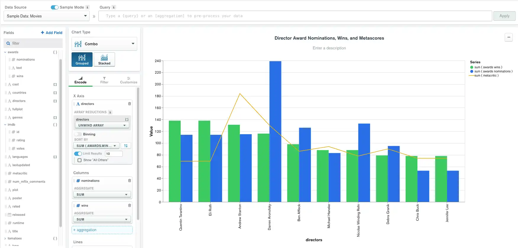
The following grouped combo chart shows the number of award nominations, wins, and metascores by director.
The X Axis category of director creates a group
for each director in the data set, and each group is split by the
Columns encoding channel fields of nominations and
wins. The Lines encoding channel field of
metacritic displays as a line:

Stacked Combo Chart
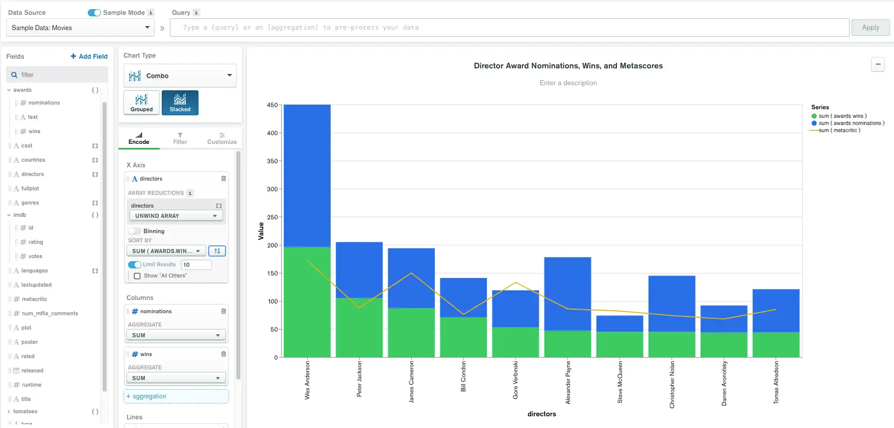
The following stacked combo chart shows the number of award nominations, wins, and metascores by director.
The X Axis category of director creates a column for
each director in the data set, limited to
only the top 10 as sorted by the aggregated sum of awards.wins from
Columns. The Columns encoding channel fields of
nominations and wins segment each column. The Lines
encoding channel field of metacritic displays as a line:

Limitations
The maximum query response size for combo charts is 5000 documents.