Estimated Time to Complete: 5 minutes
To create each chart, you will populate the chart's encoding channels with fields from your schema. Encoding channels represent the information passed to Atlas Charts which allows Charts to create the visualization.
Construct the Chart
To discover which directors of films represented in this dataset have
won the most awards, use the directors and awards.wins database
fields in your chart. The genres field provides additional
insight into the specific genres of the films for which these directors have won awards.
A column chart makes it easy to sort and compare fields with numerical values, so it is a good choice for this use case.
Select the dashboard.
From the Dashboards page, select the dashboard where you want to add a new chart. For instructions on setting up a dashboard, see Dashboards.
Add the desired fields to the proper encoding channels.
Drag the
directorsfield from the Fields section of the Chart Builder view to the X Axis encoding channel.In the
directorsArray Reductions dropdown, select Unwind Array.In the Fields section click the
awardsfield to expand theawardsobject and view its properties.Drag the
awards.winsfield to the Y Axis encoding channel. The Y Axis encoding channel determines which field to use for the chart's aggregation.Leave the Aggregate dropdown menu for the Y Axis encoding channel on its default value of sum. This value directs the aggregation operation to return the total number of award wins for each director.
Example
Aggregation
Aggregation processes data records
using a wide variety of methods and returns computed results
which may not be available in the original dataset. Because we
are interested in the total number of awards won by each
director, we use the awards.wins field here and will use
an aggregation operator which will allow us to add up the
total wins for each director.
Apply a limit to the X axis.
At this point there are too many columns in our X axis to show any meaningful results. To bring the number down to a manageable level, we'll apply a limit to get the ten directors with the most award wins.
The directors array is already sorted by the aggregated value
of wins in descending order. To apply a limit to the number
of columns in the X Axis:
Toggle Limit Results to On.
Set the value of the adjacent numeric field to
10.
Group awards by genre.
Drag the
genresfield to the Series encoding channel.In the Array Reductions dropdown menu, select
unwind array. The X axis columns are now broken down by movie genre.Note
Some movies contain more than one genre, so the numbers shown in the columns may not be the exact number of awards for each director.
Title your chart.
Hover over your chart title above the center of the chart and click the pencil icon.
Copy the following into the chart title input:
Directors with Most Awards, Split by Genre Click the check mark to save your title.
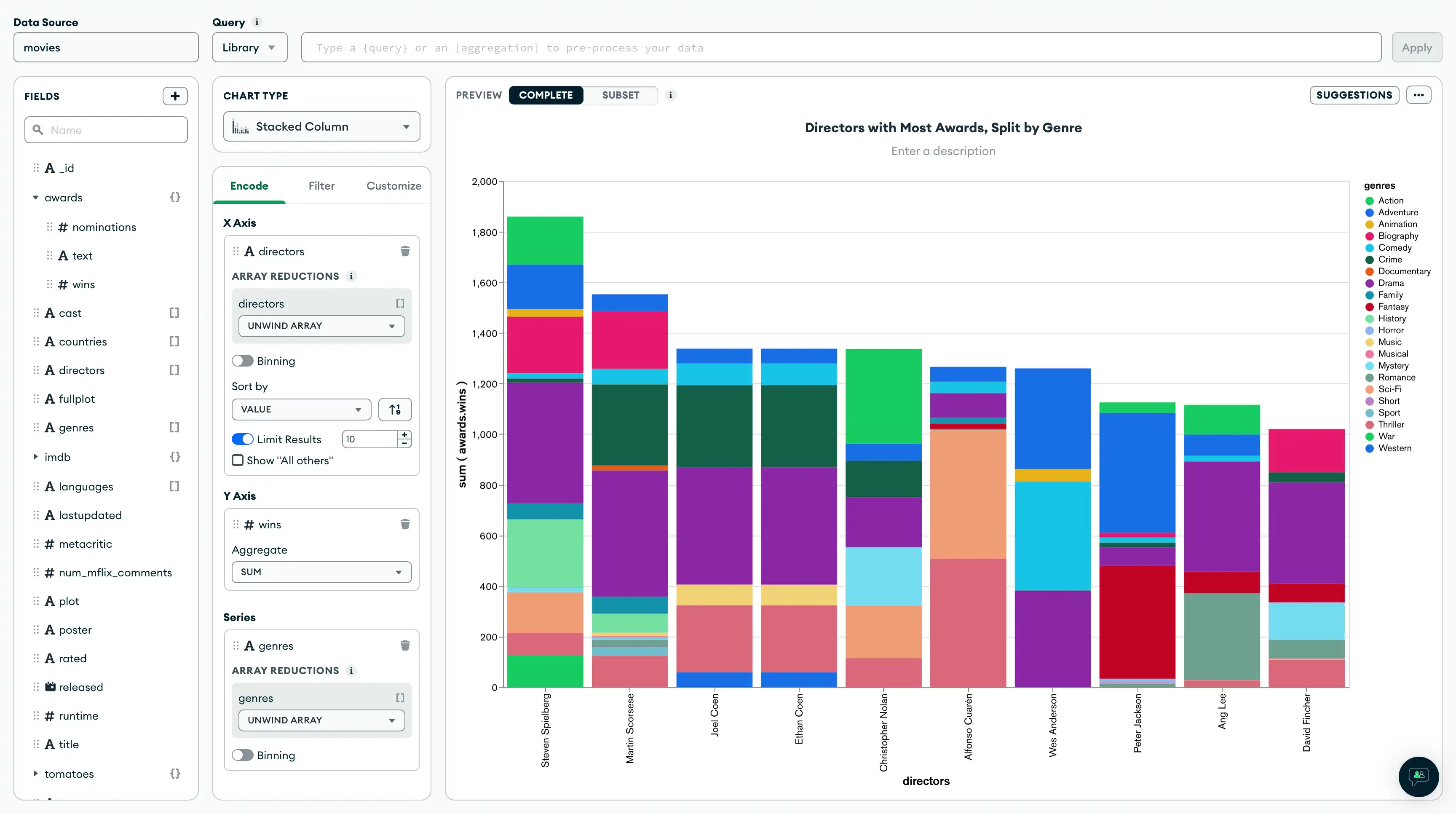
Your chart should now look like this:
![Directors with the most awards]() click to enlarge
click to enlargeClick Save and Close to return to your dashboard.
Next Steps
Follow along to the next section of the tutorial to build a scatter chart of award-nominated movies and their respective TomatoMeter ratings.
