Atlas Charts supports building multi-series charts, which split your chart data into groups, or series, to compare additional fields within your schema. There are two ways to create multi-series charts:
Map Multiple Fields to a Single Axis. Use this method to compare or aggregate upon multiple non-categorical fields in the schema.
Using the Series field in the chart builder. Use this method when grouping data based on a discrete list of items.
Map Multiple Fields to a Single Axis
Atlas Charts allows you to map multiple Aggregation or Value fields to a single chart property (such as the X Axis or Y Axis). This allows you to compare additional fields by creating new series based on the encoding channels added.
After dragging a field to an aggregation or value encoding channel, an additional optional encoding channel of the same type appears below the one which was just added, allowing you to add additional series to your visualization. This process repeats with each channel you add, so you can map as many fields as desired to your chart.
Example
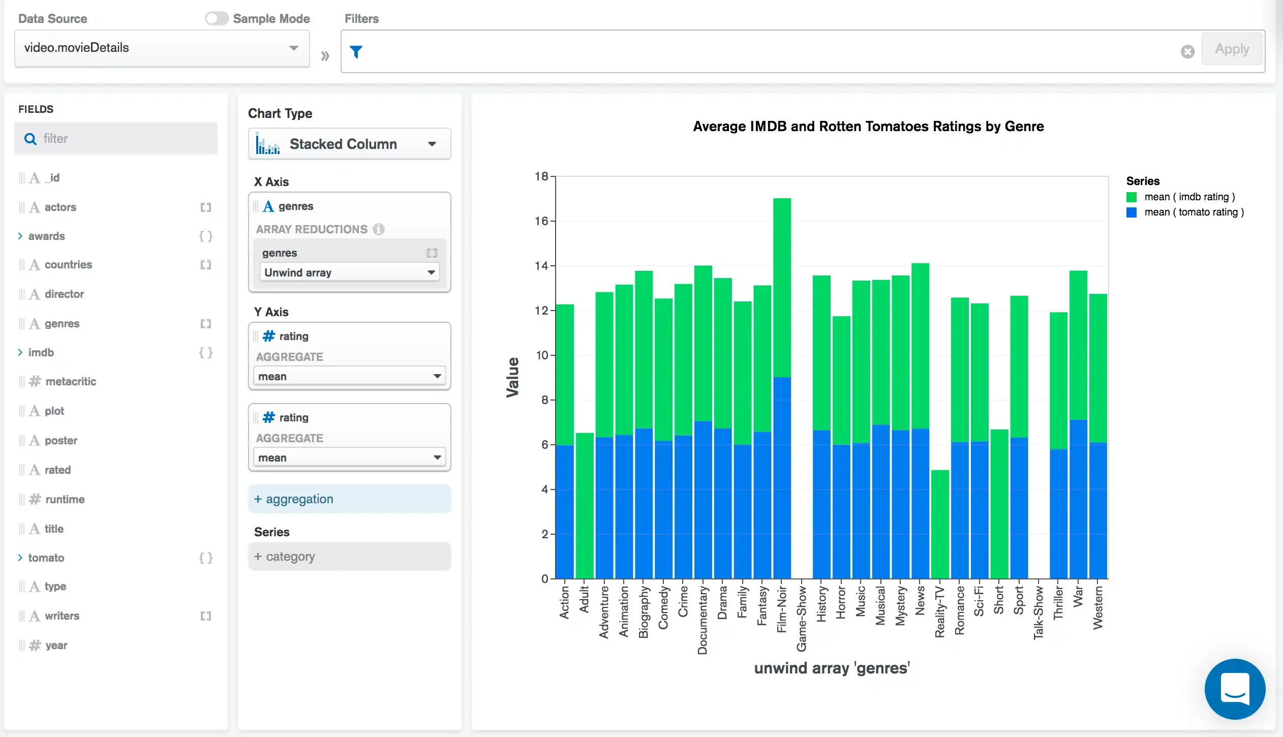
The following multi-series column chart shows average movie ratings by genre from two different sources: IMDB and Rotten Tomatoes:

There are two aggregation encoding channels on the chart's Y Axis, one for each of the site's rating fields. By selecting the mean aggregation option, the chart aggregates these two fields using the $avg operator to provide a comparison of the average of two fields in the same column.
Tip
Use multiple field mappings to create a multi-series chart when the values being compared in the visualization come from two or more separate fields in the schema.
In the example above, there is one series for Rotten Tomato ratings and one series for IMDB ratings. Since these are separate fields within the schema, adding multiple aggregation encoding channels to map the data is the best choice to compare the fields.
Tip
If you omit the Category field, you can create a single-series chart based on your selected aggregated fields. To learn more, see Create a Single-Series Chart with Multiple Aggregations.
Use a Secondary Y Axis
If you map multiple Aggregation or Value fields to the Y axis, you can plot one set of values on a secondary Y axis.
Series Field
You can also create multi-series charts by using the Series field in the chart builder. The Series field differs from aggregation encoding channels because it instead utilizes a Category encoding channel instead of a Value or Aggregation channel. When creating a series using the Category encoding channel, each unique value from the data field becomes a series in the visualization.
Example
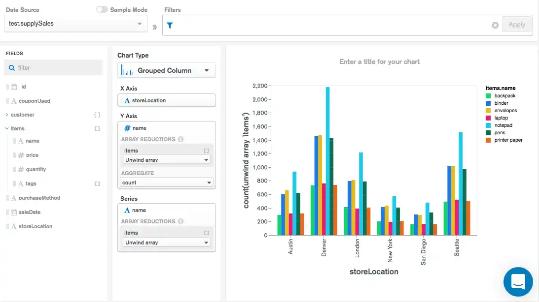
The following multi-series column chart shows order data from an office supply store, showing the most common items sold by store location:

By using the item.name in the Series encoding
channel, a series within each location group is added for each
item name.
Tip
The Series field is useful when you are grouping data based on a discrete list of items. This approach should be used when the values for all series are stored in a single field, with a separate field used to establish the discrete categories.
count by value Aggregation Option
When you drag a field onto an aggregation channel, you can select the count by value option to create a multi-series chart based on the values contained in the field. A series is automatically created for each unique value from the field, with the chart value representing the number of occurrences.
Your chart can display multiple count by value fields with additional aggregations, as long as there is no field mapped to the category axis.
Note
If any field in the X or Y axis channel has the count by value aggregation selected, the Series channel is disabled, and any field previously mapped to that channel is removed.
Example
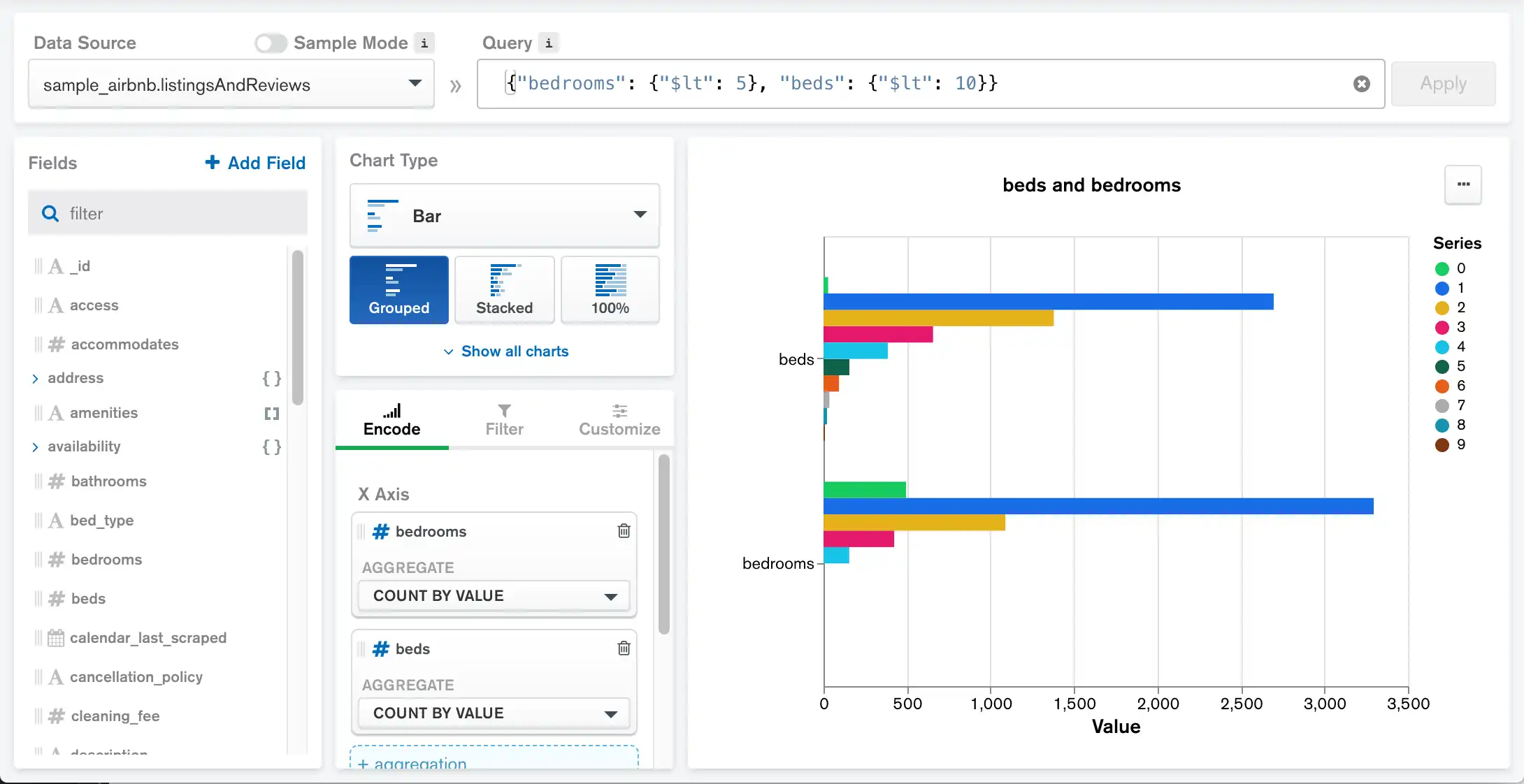
The following multi-series bar chart uses the sample_airbnb
database. It groups listings by the number of beds and the number of
bedrooms they have, showing the total number of listings for each
value.

You can also create a multi-series chart with a count by value aggregation channel and a category axis channel.
Example
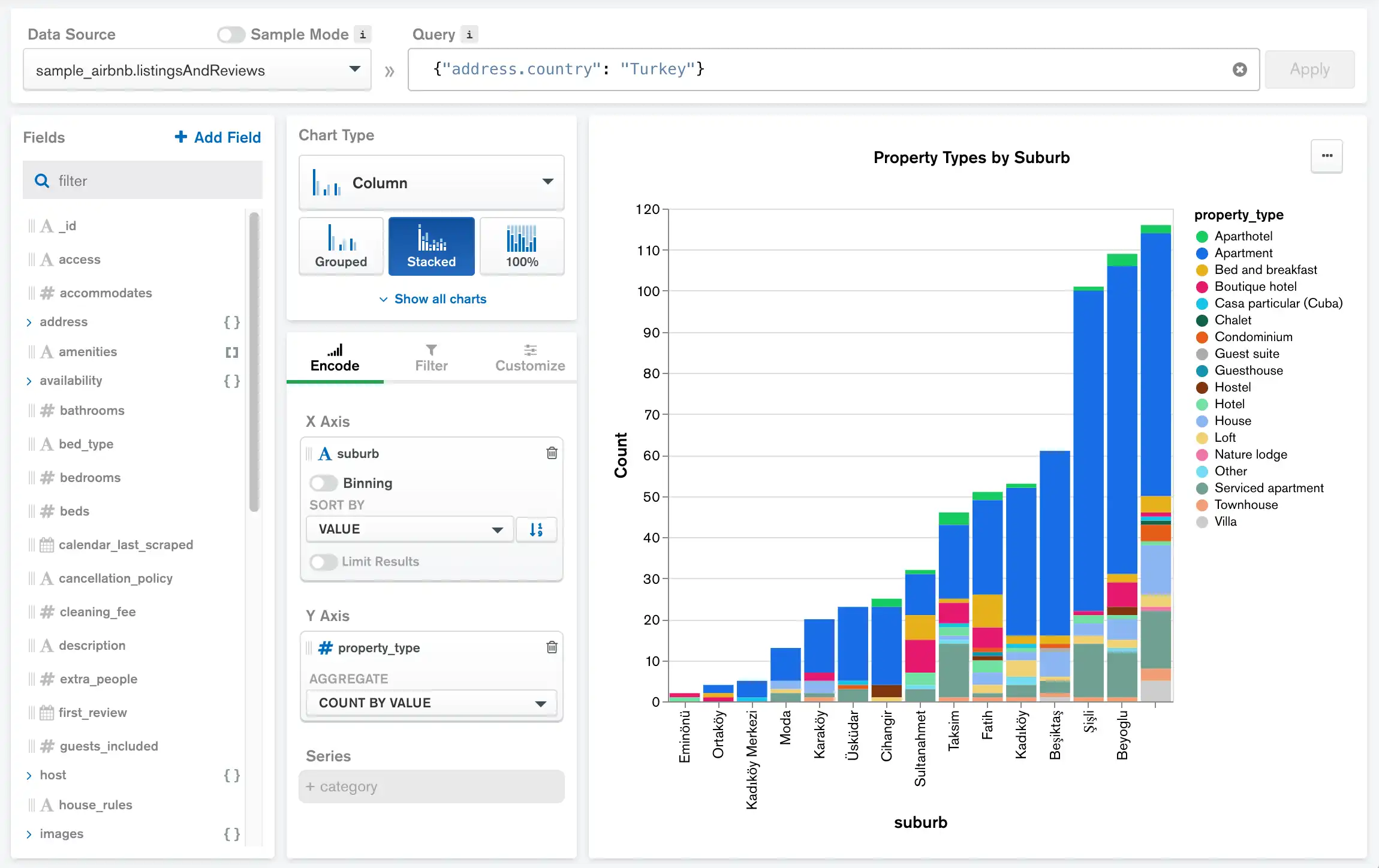
The following multi-series stacked column chart uses the sample_airbnb
database. It shows all the different suburbs of Turkey with the number of
each distinct type of property located there.

The address.suburb field populates the X axis, while
the stacked columns represent all the different property types and the
total number of each.