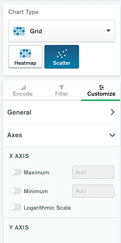
Atlas Charts offers several customization options which modify the representation of a chart's X and Y value axes without affecting the formatting of the data points in the visualization.
Note
This page illustrates the value axis customization options which are available for most chart types. Some chart types have other customization options which are noted on their individual documentation pages.
To access value axis customization options, expand the Axes section of the Customize tab.

Note
A value axis shows a continuous scale of values. Charts such as Bar/Column and Discrete Line/Area have just one value axis. Continuous line and area and scatter charts have two value axes.
Max and Min
The Max and Min value axis options allow you to specify maximum and minimum values to display on a chart. Any data points with values outside the specified limits appear at the boundaries of the chart. Setting a maximum display value is useful for removing outlying data from the chart and allowing the viewer to focus on more relevant information.
Note
Changing the minimum for bar and column charts from the default of zero is not recommended. Doing so means the length of the bars is no longer proportional to the data point values.
The following chart types can use max and min:
all Bar/Column except 100% stacked
Logarithmic Scale
Toggling the Logarithmic Scale switch to the On position causes your chart to use a logarithmic scale instead of a linear scale for data values. Using a logarithmic scale is helpful for showing the percentage change from one value to the next and for charts with a large value differential from smallest to largest. Data sets such as stock market movements, earthquake strength measurements, and global population sizes are good use cases for a logarithmic scale chart.
Logarithmic Scale Considerations
Use the Logarithmic Scale option only with chart data that consists of either all positive values or all negative values. If the chart includes a mix of positive and negative values, or if it includes the value
0, the chart will not render.Bar and column charts normally have a baseline of
0, but logarithmic scale charts have a baseline of1becauselog(0)is undefined. As a result, charts with data points between0and1do not render well. You can mitigate this effect by setting the axis minimum of the chart to a value greater than zero but smaller than the lowest value in the data set.
The following chart types can use logarithmic scale:
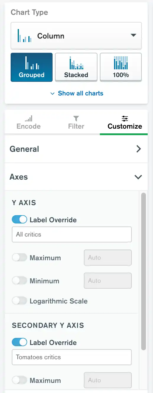
Label Override
The Label Override field allows you to create a custom axis label. Custom labels can be more descriptive than the default labels and help chart viewers quickly grasp the significance of chart data.
The Label Override customization option is available on the X
or Y value axis for charts in which the author has encoded multiple
data series by mapping more than one field on a given axis.
To customize the axis label for charts that have a single field mapped,
use the Label Override option within that field's customization
options.
The following chart types can use label override:
Secondary Y Axis
If you map multiple Aggregation or Value fields to the Y axis, you can plot one set of values on a secondary Y axis. This customization option is useful for comparing two data series with significantly different scales using the same chart.

Usage
You can plot a secondary Y axis on the following chart types:
To plot a field on a secondary Y axis:
Click the Customize tab above the encoding channels in the Chart Builder.
Expand the Fields section of the Customize tab.
Select the field you want to plot on a secondary Y axis from the dropdown menu.
Set the Plot on Secondary Axis toggle switch to On.
After the secondary Y axis is enabled, you can customize its value axis options.
When the secondary Y axis is used for at least one series, two separate legends appear for the left Y axis and the right Y axis, each showing the series mapped to that legend.
Example
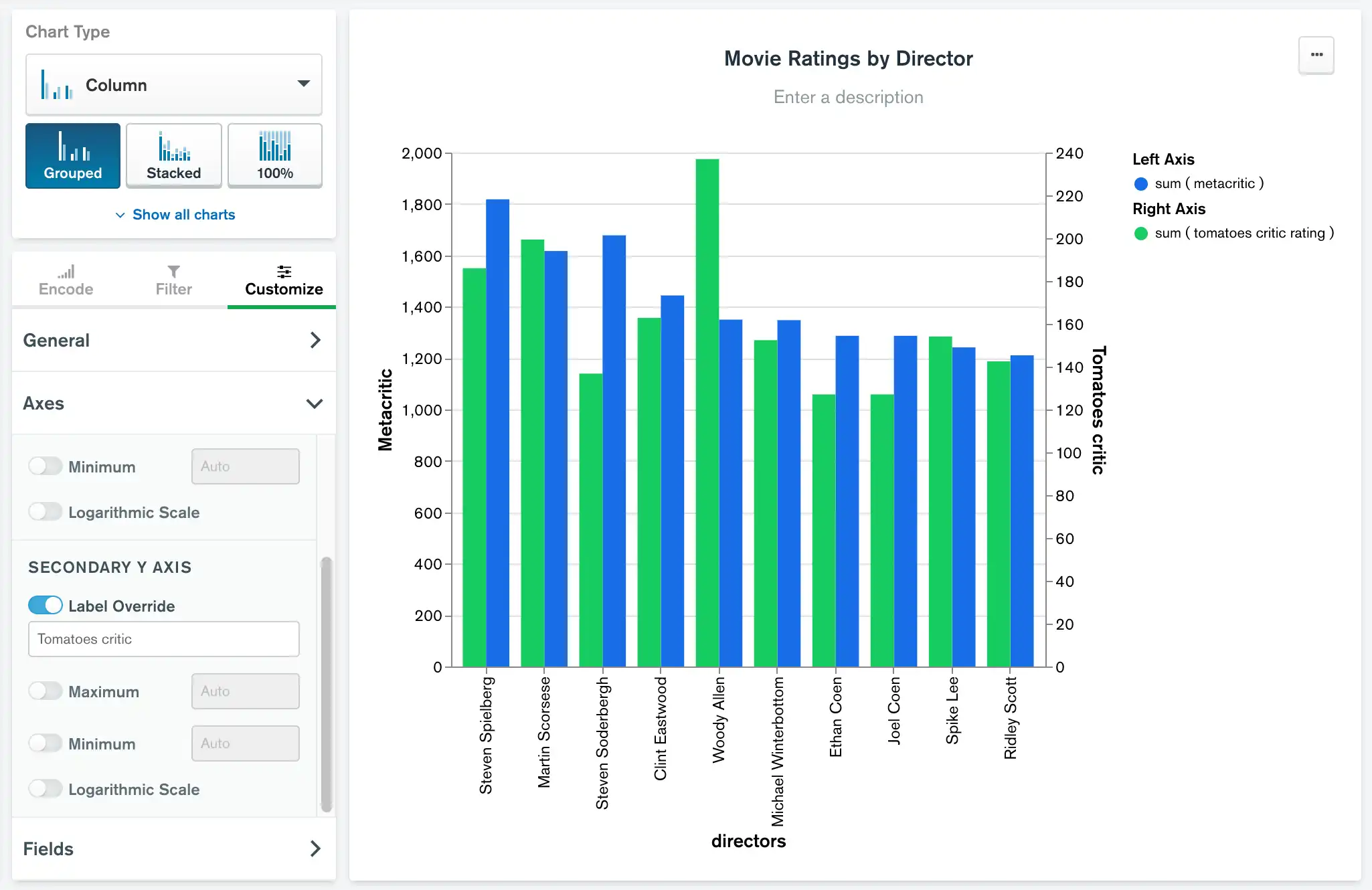
The following chart uses the movies collection in the sample_mflix
database. The metacritic field rates movies on a scale of 0-100, while
the tomatoes.critic field uses a scale of 0-10. This chart shows the
total scores for all movies for ten directors, with the metacritic
totals on the left Y axis and the tomatoes.critic totals on the right.
The chart shows that Woody Allen gets better ratings from the Rotten Tomatoes reviewers, while Steven Soderbergh does better with the Metacritic reviewers.
