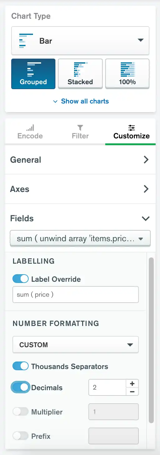
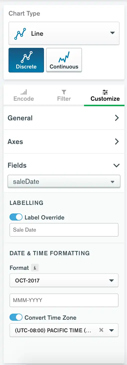
Within the customization tab, you can modify how Atlas Charts displays data fields in your visualization. The customization options available depend on the data type of the value you are customizing.
Note
This page illustrates the field-level customization options which are available for most chart types. Some chart types have other customization options which are noted on their individual documentation pages.
To access field-level customization options, expand the General section of the Customize tab. Select the desired field from the dropdown menu.

Field Label Override
When you encode a field in the Chart Builder, Atlas Charts automatically generates a label for the field in the visualization. Charts generates the label based on the field name and the type of aggregation applied to the field if appropriate. You can use this customization option to override the default label to provide more insightful or descriptive field labels.
To override a field label:
Navigate to the Customize tab in the Chart Builder.
Expand the Fields section.
Select the field whose label you wish to modify from the dropdown menu to expand its customization options.
Set the Label Override toggle switch to On.
Enter the new desired field label in the text box.
This option affects all places in the chart the field label appears, including axis titles, legends, tooltips, etc. Your chart automatically updates to show the new label. This option is available on all chart types.
Number Formats
You can use these customization options to specify how Charts formats numbers in your data fields. These options are available on all chart types.
Number Format Options
Atlas Charts provides the following options for formatting numbers. You can use any combination of these options to customize your chart:
Option | Description |
|---|---|
Thousands Separators | Show or hide commas as thousands separators for data values. By default, Charts shows thousands separators. |
Decimals | Specifies to how many decimal places Charts rounds each data value or label. If you specify this option, Charts displays all values with the specified number of decimal places, either by rounding decimals or adding zeroes to whole numbers. If you do not specify this option, Charts displays values in their original form with no modifications. |
Multiplier | Specifies a number by which Charts multiplies each data value or label. This option is useful for scaling data, such as showing values in terms of thousands or millions. You can also use this option to convert measurements or currencies to different units by multiplying your values by the appropriate factor. |
Prefix | Specifies a string which Charts prepends to each data
value or label. This option is useful for formatting currencies
by prepending characters such as |
Suffix | Specifies a string which Charts appends to the end of
each data value or label. This option is useful for providing
context to your data by appending units, such as |
Number Format Presets
Charts provides the following preset customizations to format numbers for common use cases:
Option | Description |
|---|---|
Percentage | Multiplies each value by 100 and appends a |
Dollars | Rounds each value to two decimal places and prepends a
|
Thousands | Divides each value by 1,000 and appends a |
Millions | Divides each value by 1,000,000 and appends an |
If you select a preset, you can modify any of its attributes to further refine your numeric displays. Once you modify a preset's attribute, Charts changes the preset selection in the dropdown to Custom.
Date Format and Time Zone
You can customize how Atlas Charts displays date fields, as well as convert dates to a specified time zone.

To customize date formats and configure time zones:
Navigate to the Customize tab in the Chart Builder.
Expand the Fields section.
Select the field whose date format and time zone you wish to modify from the dropdown menu.
Configure the Date and Time Formatting and Convert Time Zone settings as desired.
Date and Time Formatting
Use this option to specify how Charts formats dates and times. Click the dropdowns in this customization section to select a preset format provided by Charts. Charts provides one dropdown for selecting a date format and one dropdown for selecting a time format.
Note
Depending on the binning type selected for the field, Charts may not show both date formatting dropdowns. Also, the options in the dropdowns change depending on the binning type selected.
For more information, see the Considerations section.
You can also use the input box below the dropdowns to specify a custom datetime format. The following table shows how to create custom datetime formats:
Symbol | Meaning | Example |
|---|---|---|
YYYY | Full year. |
|
YY | Last two digits of year. |
|
MMMM | Full month as letters. | November |
MMM | Abbreviated month as letters. | Nov |
MM | Month as numbers, with leading a zero if applicable. |
|
M | Month as numbers with no leading zero. |
|
[W]WW | Week of the year preceded by a |
|
W | Week of the year as numbers with no leading zero. |
|
DDDD | Day of the year, with leading zeroes if applicable. |
|
DDD | Day of the year with no leading zeroes. |
|
DD | Day of the month with a leading zero if applicable. |
|
D | Day of the month with no leading zero. |
|
HH | Hour with a leading zero if applicable. Uses 24-hour time format. |
|
H | Hour with no leading zero. |
|
A | Adds the applicable |
|
mm | Minute with a leading zero if applicable. |
|
m | Minute with no leading zero. |
|
ss | Second with a leading zero if applicable. |
|
s | Second with no leading zero. |
|
Example
Consider a timestamp of November 8th, 2018 1:30:58 PM. The following table shows how various custom date filters would output the date:
Custom Format | Output |
|---|---|
|
|
|
|
|
|
|
|
Once you modify a preset's attribute, Charts changes the preset selection in the dropdown to Custom.
Considerations
If you bin your timeseries data, you cannot specify a unit of time in your custom format with smaller granularity than your bin size. For example, if you bin data by Month, you cannot specify days, hours, minutes, or seconds in your custom format because Charts does not show these values in the visualization. If you enter an invalid custom datetime format, Charts highlights the format input box in red.
Specifying the Periodic option further limits valid
formatting options. For example, if you bin data by Month,
you can only specify year in your date format if you disable the
Periodic option. If you enable the Periodic
option, you cannot specify year because Charts only
displays the month in the field.
Convert Time Zone
By default, Atlas Charts displays timeseries data exactly how it appears in the original dataset, which is assumed to be in UTC. You can use this customization option to convert the time zone in which Charts displays the data to best fit the location of the data or the viewers of the chart.
To enable this option:
Set the Convert Time Zone toggle switch to On.
Use the dropdown below the toggle to select the desired time zone for your data.
Note
When you convert time zones, Charts automatically accounts for Daylight Savings Time when required.
You can search the dropdown to easily filter for the desired time zone. Type into the search bar above the dropdown to see all matching time zones.