Gauge Charts display data as a percentage of a semicircle, with customizable minimum and maximum values. Optionally you may also specify a Target value, which renders as a heavy line within the gauge's range.
Gauge Chart Encoding Channels
Gauge charts provide the following encoding channels:
Encoding Channel | Description |
|---|---|
Value | The data value for the chart. Each gauge chart can have only one data value. Required |
Target | A specific value of importance to the chart, such as a sales quota or maximum capacity level. If no maximum value for the chart is set, the Target value serves as the upper limit for the chart. See Target and Maximum Interaction for more information on how the maximum range of the gauge is determined. If you wish to set a specific value as the chart target, you can create a calculated field, assign it your desired value, and encode it in the Target channel. The Target channel is an aggregation. To set a specific arbitrary value, set your calculated field to a constant value and choose either Max or Min from the Aggregate dropdown menu. |
Target and Maximum Interaction
The value encoded in the Target channel and the Maximum customization affect each others' behavior. The followling table explains the effect on the chart of having one, both, or neither of the values set.
Target | Maximum | Behavior |
|---|---|---|
None | Default | No target line. Gauge maximum is the next power of 10 above the value of the Value channel. |
None | Custom | No target line. Gauge maximum is the specified value. |
Encoded | Default | Target line is rendered. Gauge maximum matches the target value. |
Encoded | Custom | Target line is rendered. Gauge maximum is the specified value. |
Use Cases
Gauge charts are useful for displaying a data value represented as a fraction of a larger value. Gauge charts are a familiar way to represent a situation in which a container may be either full or empty or somewhere in between.
Consider using gauge charts to represent:
Occupancy rates in a hotel
Progress towards a fundraising goal
The water level in a reservoir
Cutomization Options
To access the customization options, click the Customize tab above the encoding channels in the Chart Builder.

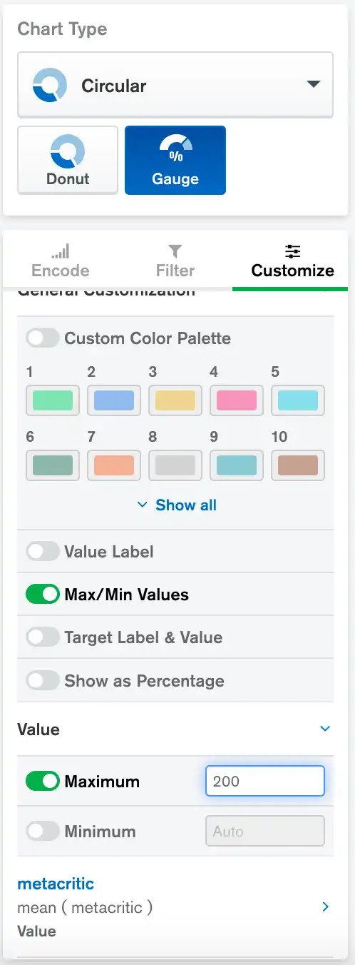
General Customization
Option | Description | Default |
|---|---|---|
Custom Color Palette | Only the first palette color is used by gauge charts. | Off |
Value Label | Controls whether a label is displayed above the Value number. | Off |
Max/Min Values | Controls whether the minimum and maximum range numbers are displayed at the left and right edges of the chart. | On |
Target Label & Value | Controls whether the Target value and its label are displayed at the bottom of the chart. | Off |
Show As Percentage | Controls whether the value of your gauge chart is shown as a percentage of the Target value. If you enable this option and do not have a Target value, the value is shown is a percentage of the maximum value. For more information, see Target and Maximum Interaction. | Off |
Value Axis
Option | Description | Default |
|---|---|---|
Maximum | Specifies the maximum range of the gauge when enabled. See Target and Maximum Interaction for more information on how the maximum range of the gauge is determined. | Off |
Minimum | Specifies the minimum range of the gauge when enabled. Defaults
to | Off |
Value Field
Option | Description | Default |
|---|---|---|
Label Override | When enabled, displays a custom label for the Value number if the Value Label option is also enabled. Displays a custom label for the Value Field tooltips. | Off |
Number Formatting | Controls formatting of the large value in the chart, the tooltips, and the min/max labels. | None |
Target Field
Option | Description | Default |
|---|---|---|
Label Override | When enabled, displays custom label for the Target value if the Target Label & Value option is also enabled. Displays a custom label for the Target Field tooltips. | Off |
Number Formatting | Controls formatting of the Target value if it is displayed under the chart. | None |
Examples
The following chart shows progress towards a goal. A clothing retailer has a goal of selling 100 green shirts per month.

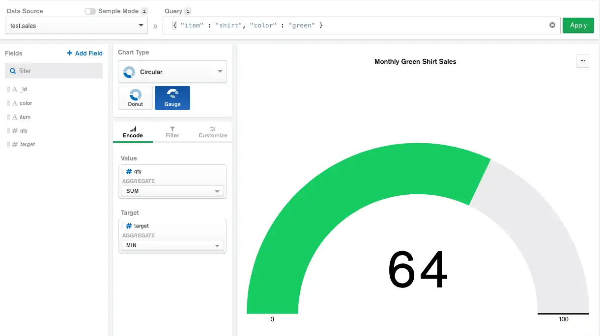
This chart uses a filter to find sales order documents in which the item
field is shirt and the color field is green. The qty field is
encoded in the Value channel to a get an aggregated total.
The 100-shirt goal is a constant value, so the chart uses a calculated
field named target with a value of 100 encoded in the
Target channel.