Tables represent data in a tabular view, similar to a spreadsheet. In Charts, tables split your data into categories, where:
Table columns represent categorization fields.
Table rows represent unique categories.
Table body displays aggregated values based on the selected categorization fields.
Table Encoding Channels
Tables use the following encoding channels:
Encoding Channel | Description |
|---|---|
Groups | The category encoding channels. Charts creates a row in the table for each unique value in this field. When multiple Groups are added to the chart, Charts creates a row for each unique combination of group fields. The Groups encoding channel supports binning for numeric and date fields. |
Values | The aggregation encoding channels. Charts creates a column for each field mapped into the Values channel. Charts aggregates the encoded Values fields using the selected aggregation methods and populates the grid cells with the aggregated value for the corresponding Group. |
Dynamic Columns | A second Category encoding channel. When you use Dynamic Columns, Charts creates table columns based on the unique values retrieved from the field mapped into the Dynamic Columns channel. Charts uses the field mapped into the Values channel to populate the grid cells, aggregated against both the Group and Dynamic Column categories. You cannot apply dynamic columns to a table if you have selected multiple Value encoding channels. For an example of how to use dynamic columns, see the following Table with Dynamic Columns. The Dynamic Columns encoding channel supports binning for numeric and date fields. |
Use Cases
Tables have a wide variety of applications, but are most useful when comparing multiple categories of calculated values. Visual charts struggle to display multiple categories of data without losing their audience. Tables present data with multiple categories such that you can see which value applies to which slice of data.
Tables are also useful for showing precise data values, rather than comparing approximate values. Comparing approximate values is best done with a visual representation, instead of text.
For example, you can use tables to show:
The total cost to rent an apartment, including rent, cleaning fees, and security deposits organized by location and total area of the unit.
Time spent working out and total calories burned during various exercises categorized by the type of exercise and time of day the exercised was performed.
Customization Options
The following customization options are specific to table charts. To see all available customization options, see Customize Charts.
Hyperlinking
You can display your data as a hyperlink.
To display your data as a hyperlink:
(Optional) Hide your column.
In the Other Options section, toggle Hide Column to On.
Note
Charts returns only encoded fields. Hiding a column preserves the encoding of a field but omits the column from the results. This is useful when you want to:
Use the field as part of the URI, but don't want the field to render on the chart.
Drive conditional formatting rules from an encoded hidden field.
To remove a hyperlink from your data:
Wrap Text
You can wrap text that does fit in a single data cell across multiple lines. This setting is off by default. To turn it on:
Pin Columns
You can pin Group and Row Total columns to the side of the table. A pinned column remains fixed in place while the rest of the table scrolls.
To pin a column, hover over the column you want to pin and click the button in the column header. The button toggles on and the column pins to the side of the table:
A Group column pins to the left of any unpinned columns.
The Row Total column pins to the right of any unpinned columns.
To unpin a column, click the button in the header of the column you want to unpin. The button toggles off and if the column is a Group column, it moves to the right of any pinned Group columns.
Conditional Formatting
You can create styling rules for table cell values that match conditions you define. Conditional formatting rules affect the look of your chart dynamically: if the value of a table cell changes to match or stop matching your conditions, its styling updates to reflect that.
To learn how to use conditional formatting rules, see the Conditional Formatting customization option.
Examples
The following table examples visualize data from a hospitality and property service. Each document in the collection represents a unit available for rent and includes information such as the monthly unit price, neighborhood, and property type.
Basic Table
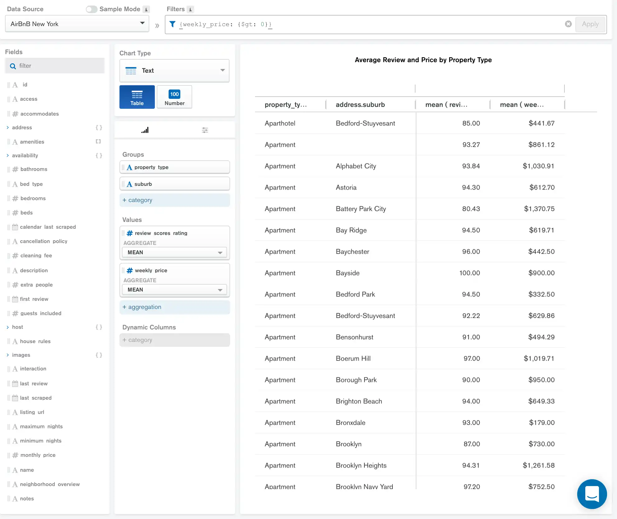
The following table categorizes the rental listings by property type and location, and shows the average review rating and average weekly rent for each group:

The Group encoding channels of property_type and
suburb create a row in the table for each unique combination
of those two fields in the data.
The Values of review_scores_rating and
weekly_price each add a column to the table. For both values, we
average the rating and price for each property type and suburb
using aggregation and display the results in
the table.
The results are formatted using the Customization tab to display the mean weekly price as currency and round the mean review score to an appropriate number of decimal places.
Note
We have applied a filter to this
chart to only display listings which have a weekly_price
associated with them.
Table with Dynamic Columns
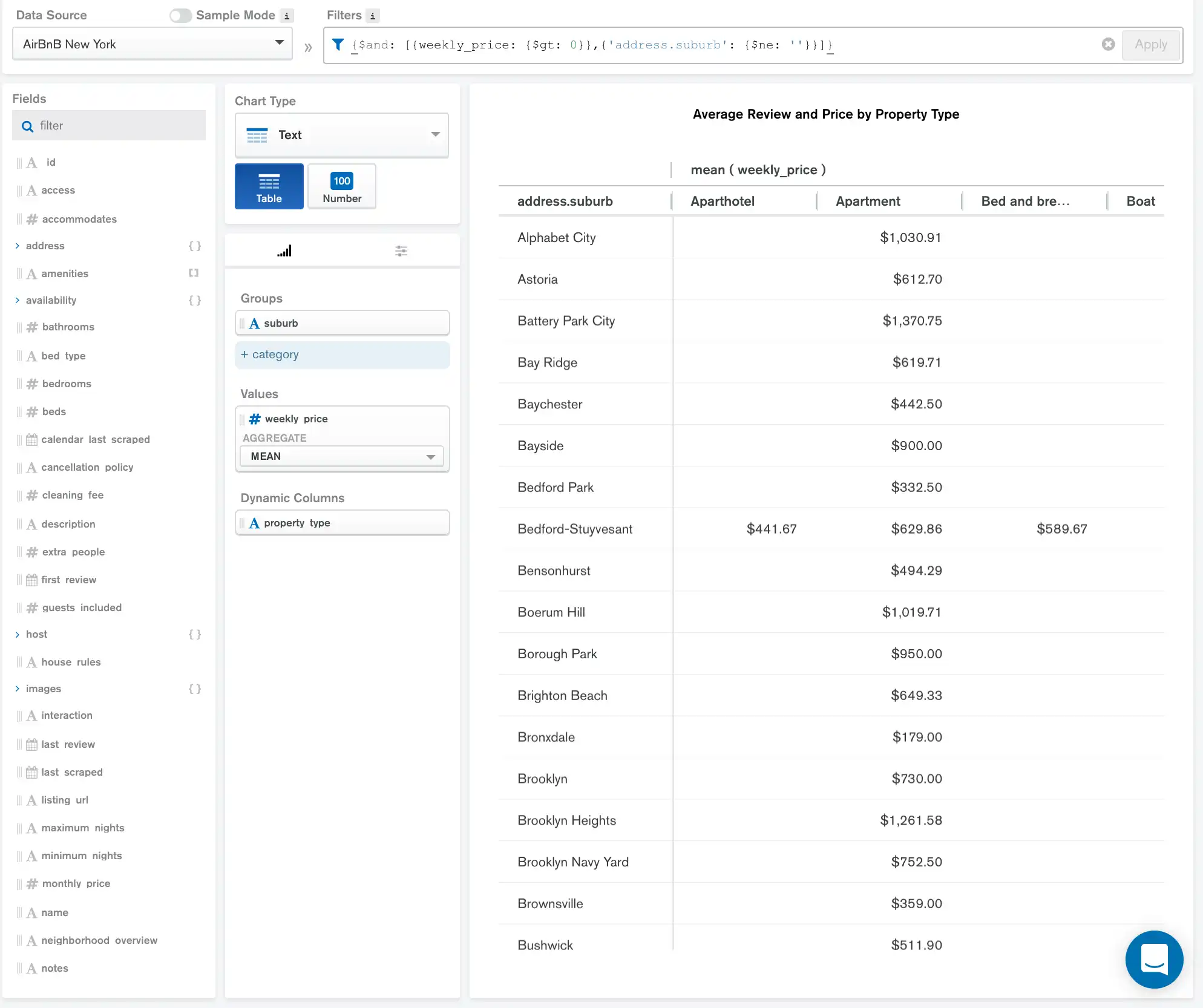
The following table displays nearly the same data as the previous
basic table example. In this example, instead of making
property_type and suburb Groups, property_type
field is now a Dynamic Column:

Now, rather than having two category columns in the table, the
property_types become column titles. We are still aggregating
the mean of the weekly_price based on each combination of
property_type and suburb.
The results are formatted using the Customization tab to display the mean weekly price as currency.
Note
Blank table cells indicate that there are no documents that match
the corresponding intersection of property_type and suburb.
Limitations
The maximum query response size for a table is 50000 documents.